
ROLE
UX/UI Designer, UX Research, Branding
TOOLS
Figma, Illustrator, Procreate
TIMEFRAME
October - December 2025
ecovision
digital product INTERFACE
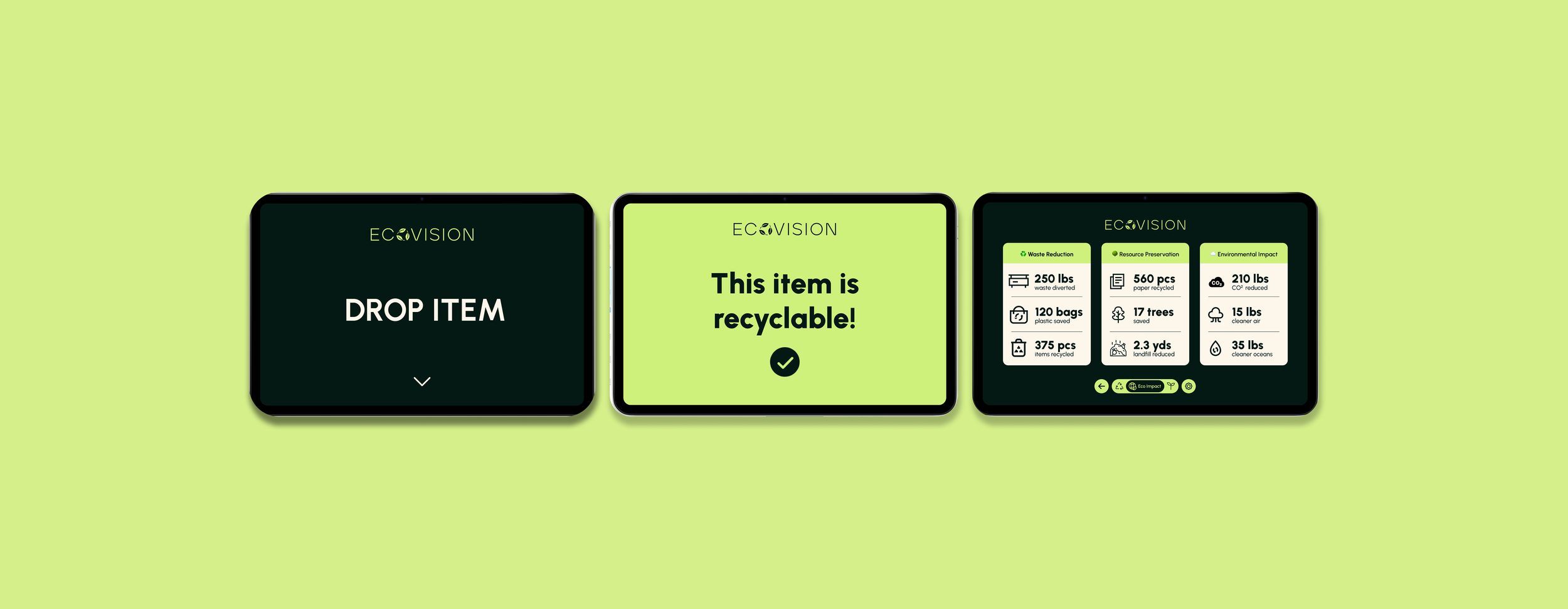
ECOVISION is a smart recycling bin designed to reduce recycling contamination by guiding users in real time. The smart bin utilizes AI object recognition, sensors, and an interactive digital screen. The product's objective is to identify and automate the sorting of materials such as plastic, paper, glass, or compost, as well as providing simultaneous, clear feedback and education to the user. ECOVISION is designed to make the recycling process more intuitive and create a more engaging experience around it.
The challenge
Recycling contamination is an extensive and national issue. The problem is that recyclable items are sent to landfills simply because users are uncertain how to sort them. In fact, according to the United States Environmental Protection Agency (EPA), about 25% of all recycling is discarded due to contamination and are instead, being sent to landfills. This problem contributes to global pollution.
Design process
OVERVIEW
User Research
Approach
empathize
User research
I researched how incorrect waste sorting leads to tons of recyclable materials being sent to landfills. The study focused on why typical recycling methods fail, identifying that most systems rely too heavily on individual user motivation and prior awareness rather than providing real-time assistance.
approach
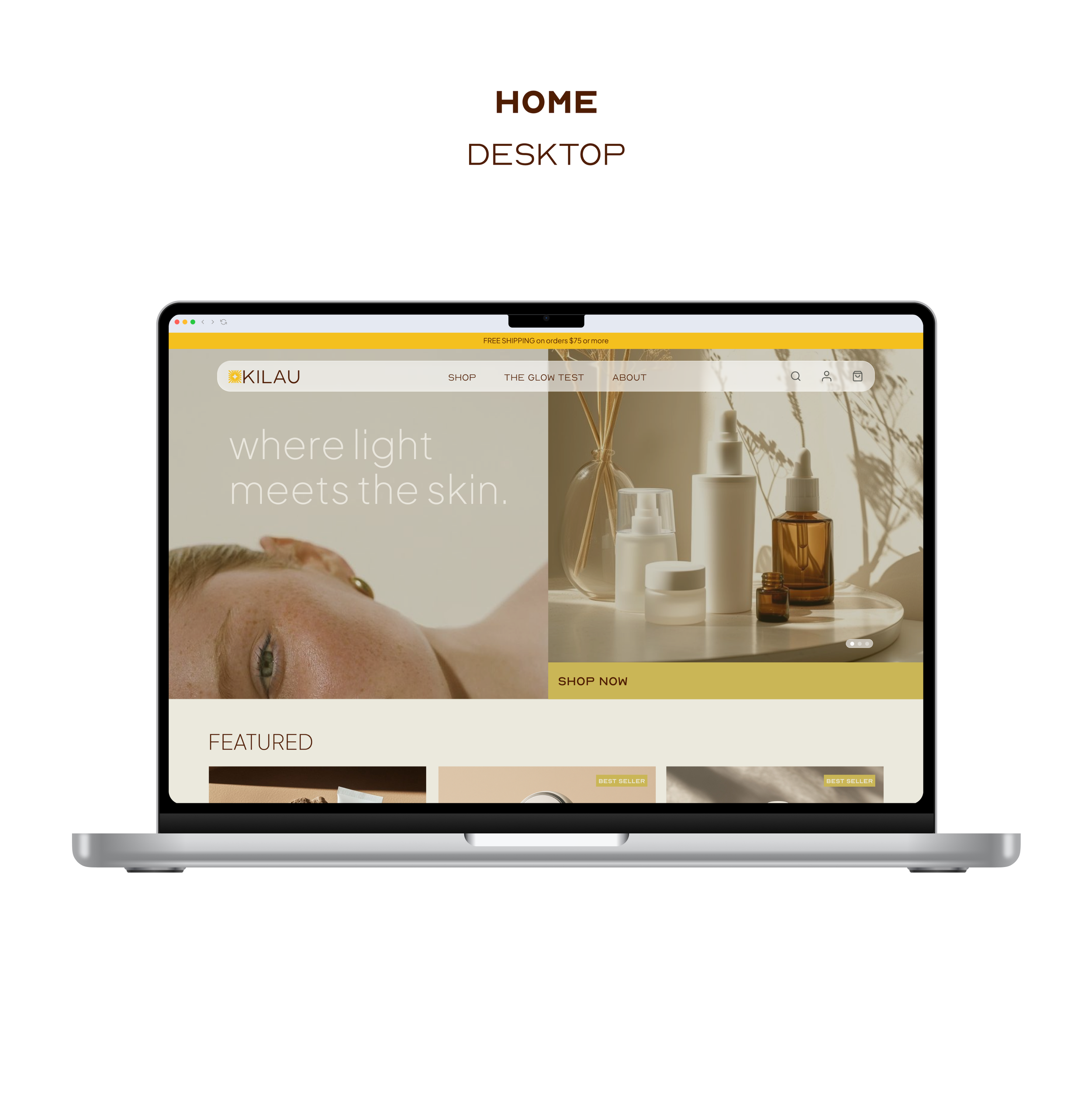
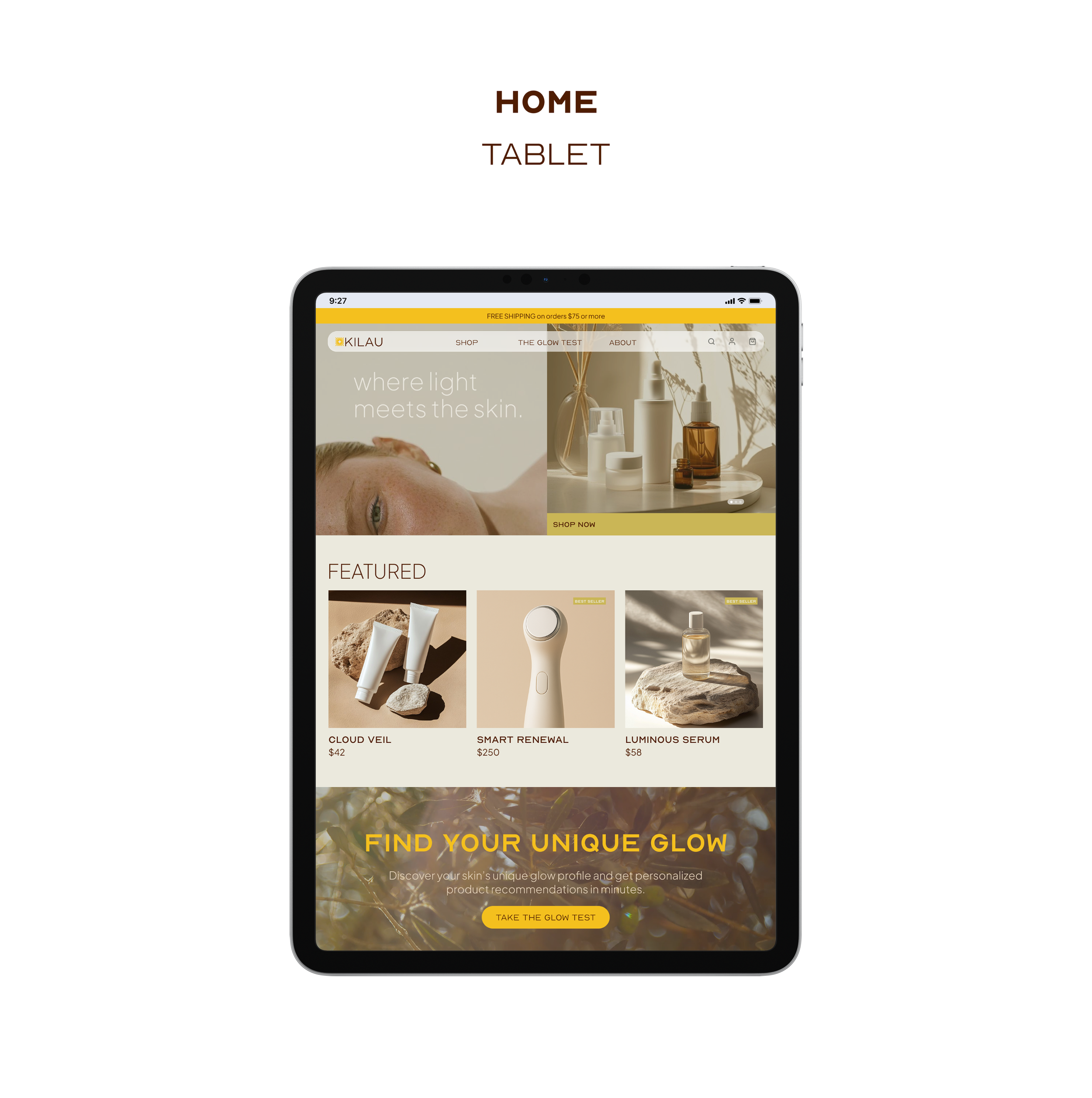
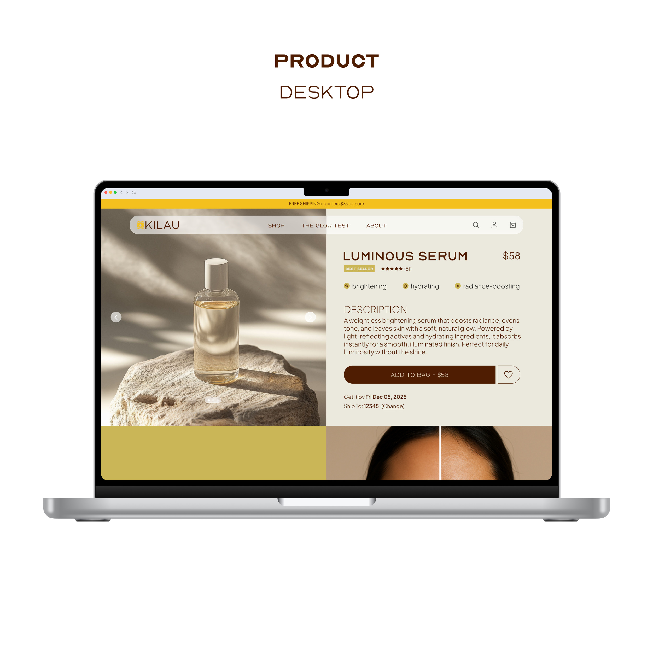
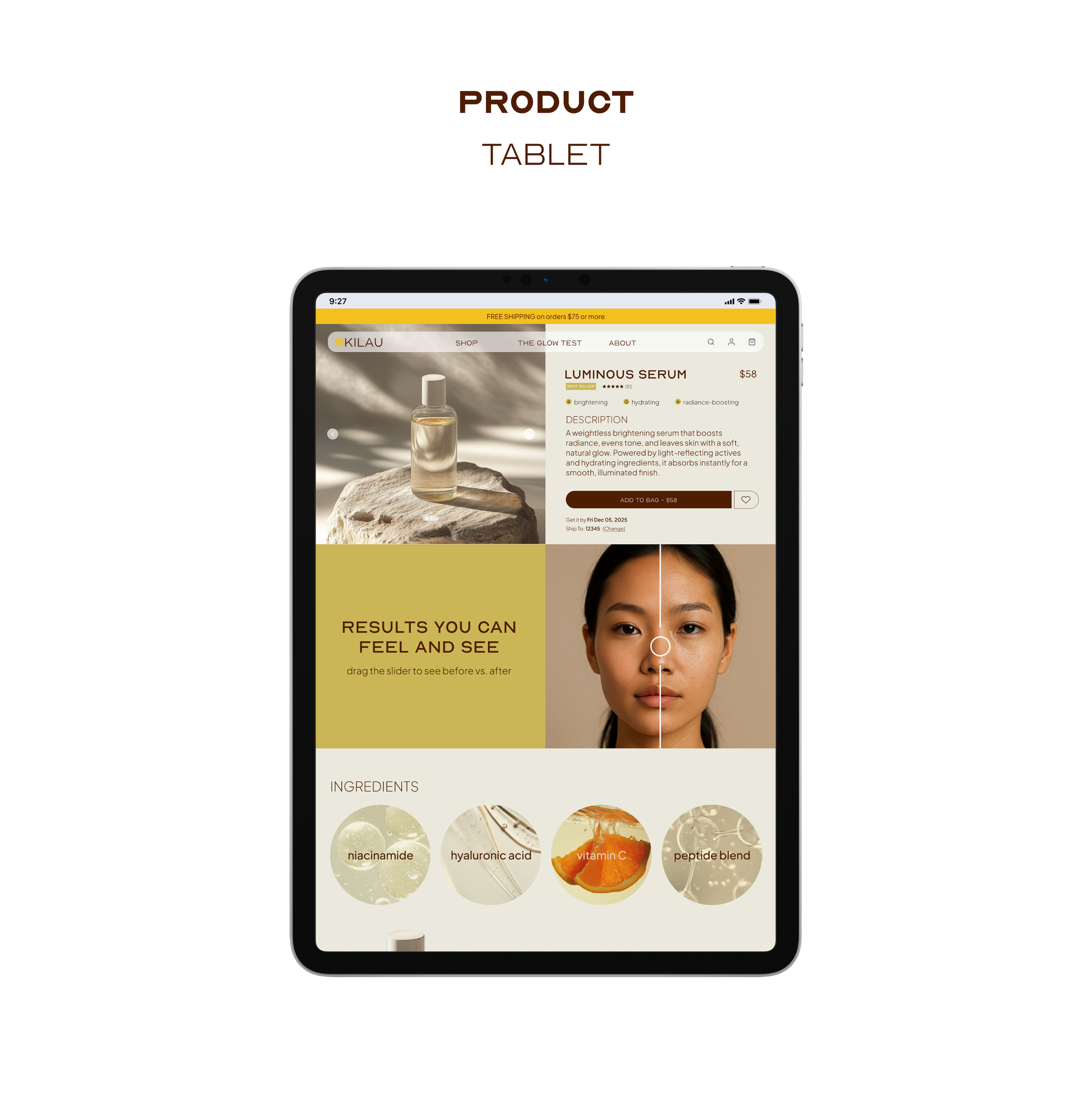
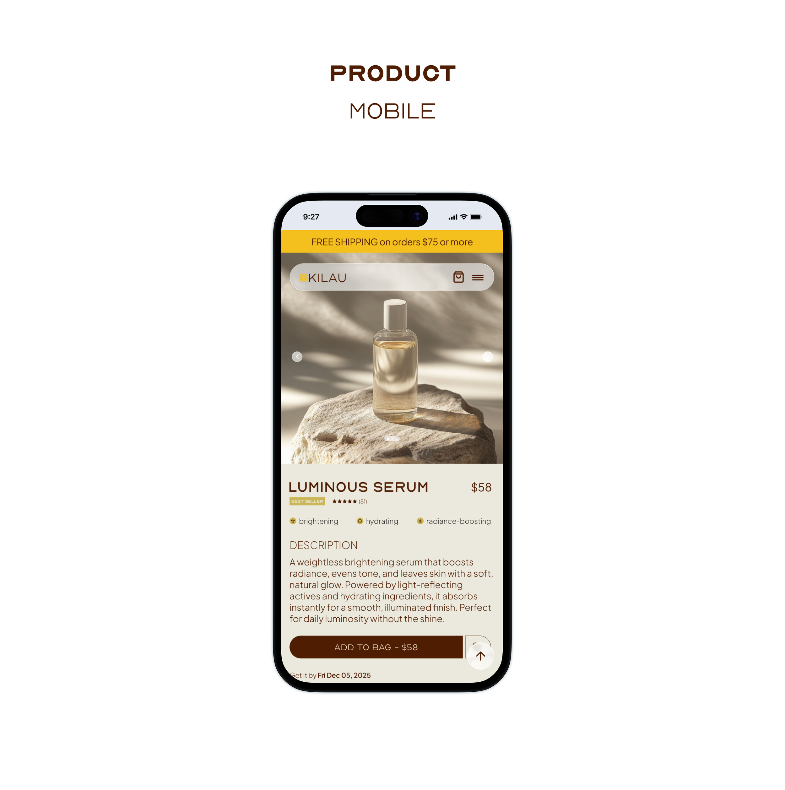
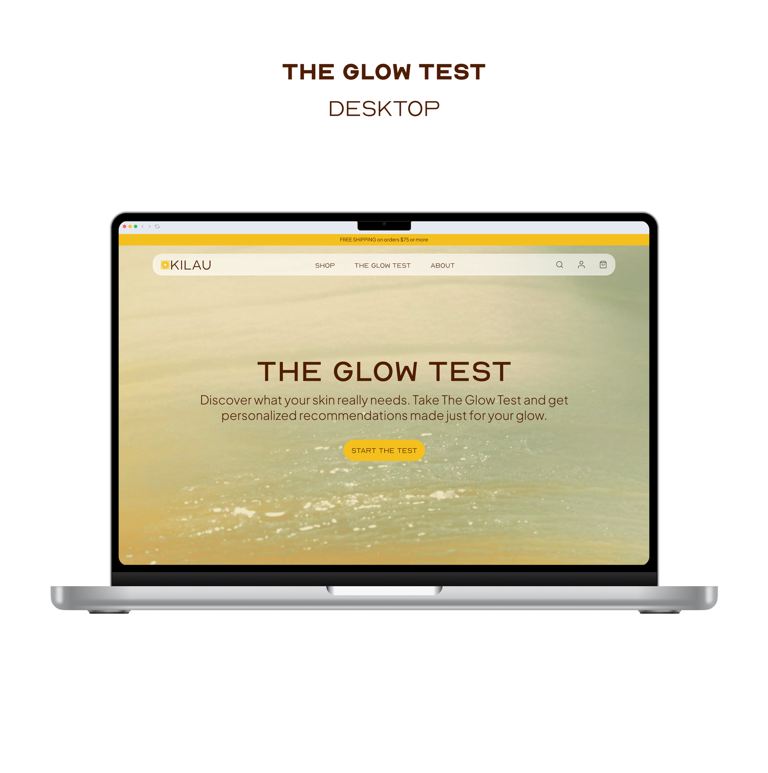
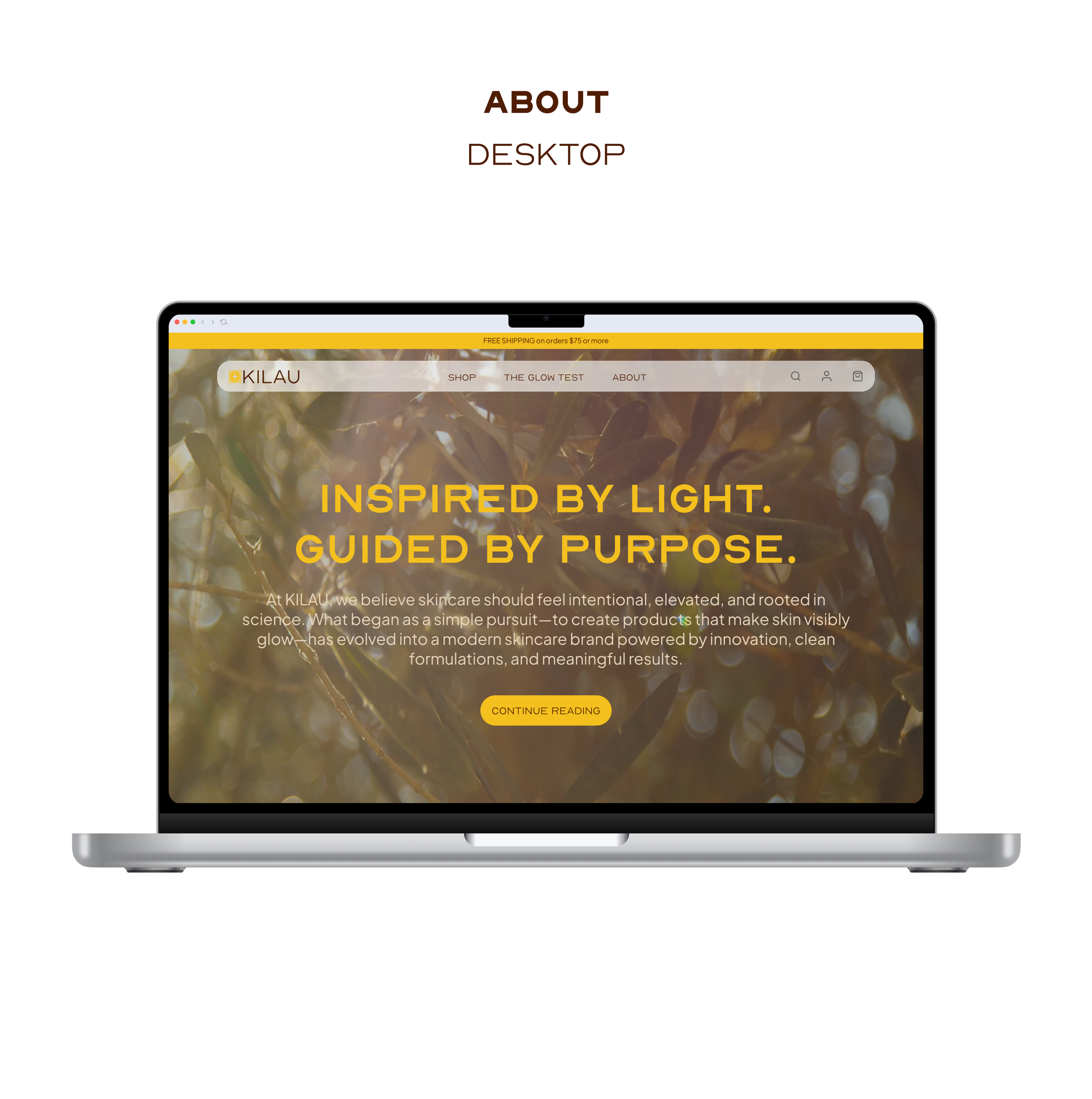
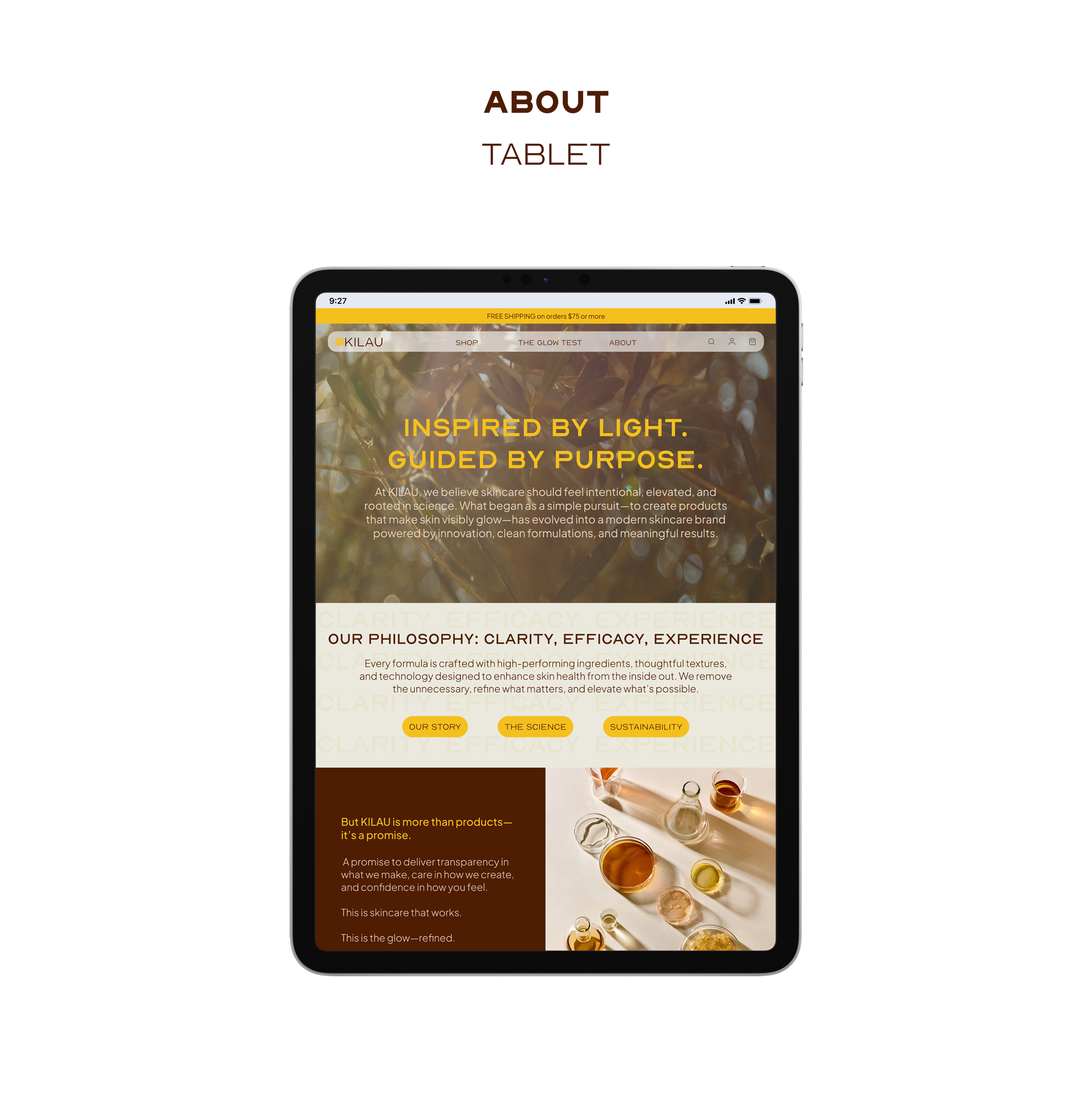
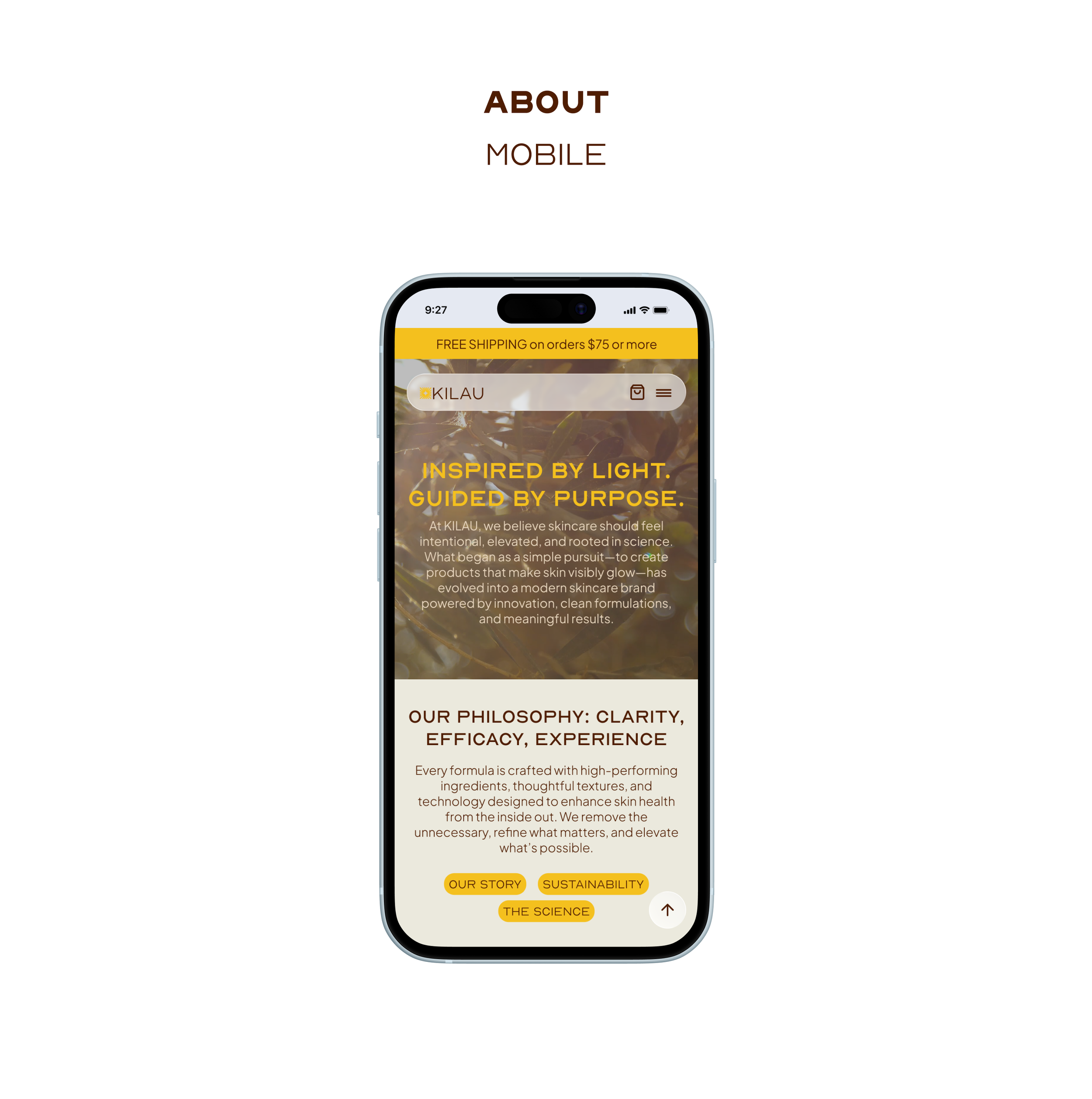
From a technical standpoint, KILAU's platform was designed with scalability and responsiveness in mind. The layout system supports desktop, tablet, and mobile breakpoints with consistent modular components. The buttons, cards, navigation, sliders, and containers are built for future expansion of additional products or content. Interactive elements such as The Glow Test were designed to be incorporated seamlessly in the shopping experience without disrupting performance or accessibility.
OVERVIEW
Key Insights
User Personas
Journey Map
define
key insights
Diagnostic uncertainty
Users struggle to accurately identify their specific skin profile.
routine friction
Overwhelming instructions lead to low adherence and abandoned carts.
PLANNING BURNOUT
the trust gap
A lack of transparency regarding "smart tech" vs. traditional skincare.
lack of guidance
Users feel paralyzed by vast product ranges and lack a clear starting point for their journey.
User personas
I developed detailed User Personas and Journey Maps to visualize the emotional highs and lows of the skincare acquisition process. By identifying "friction peaks," such as the moment a user questions a product’s price-to-value ratio, I was able to implement educational transparency markers (like ingredient deep-dives) to reassure the user.
journey map
OVERVIEW
Information Architecture
Iterative Design
ideate
information architecture
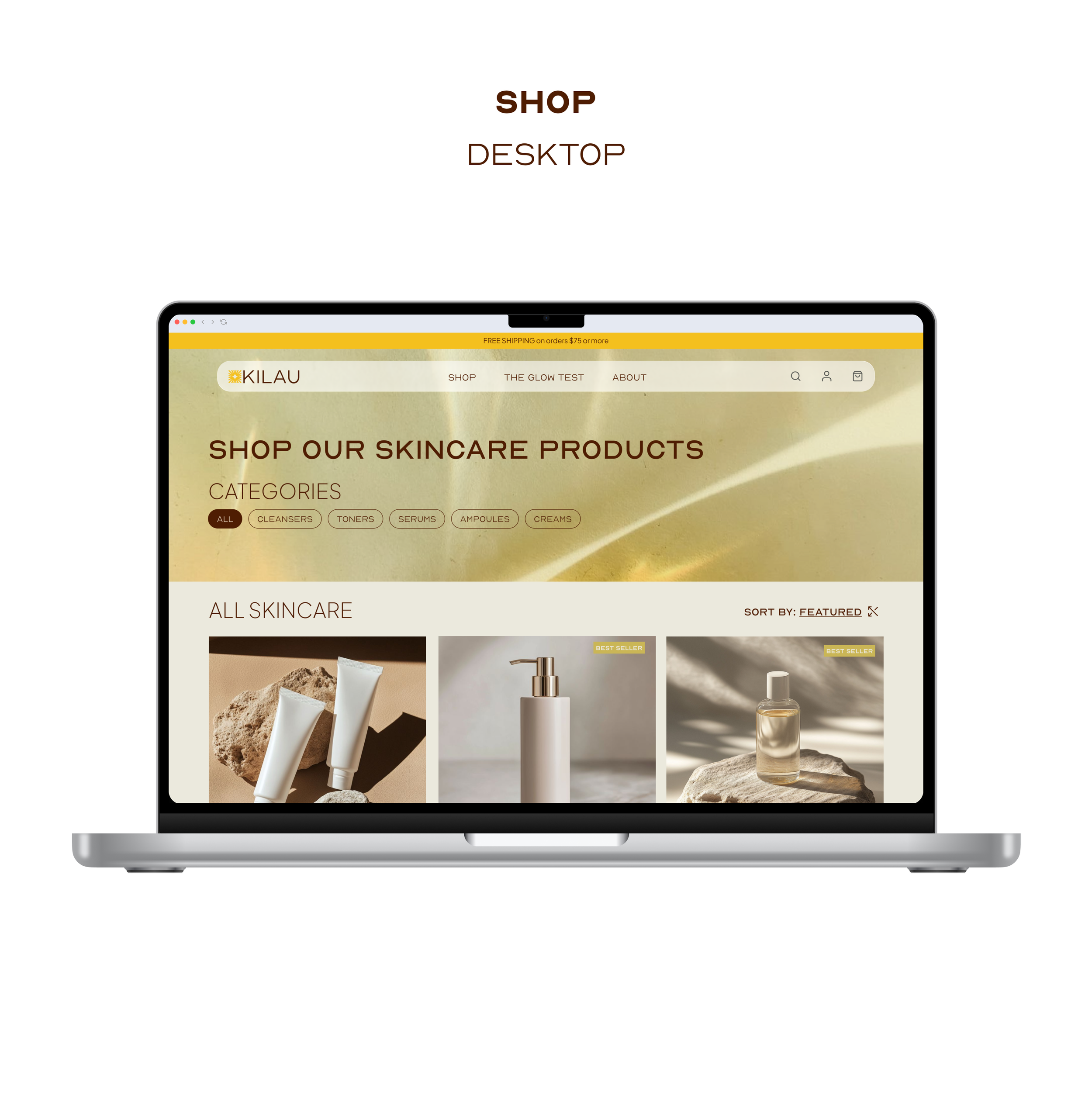
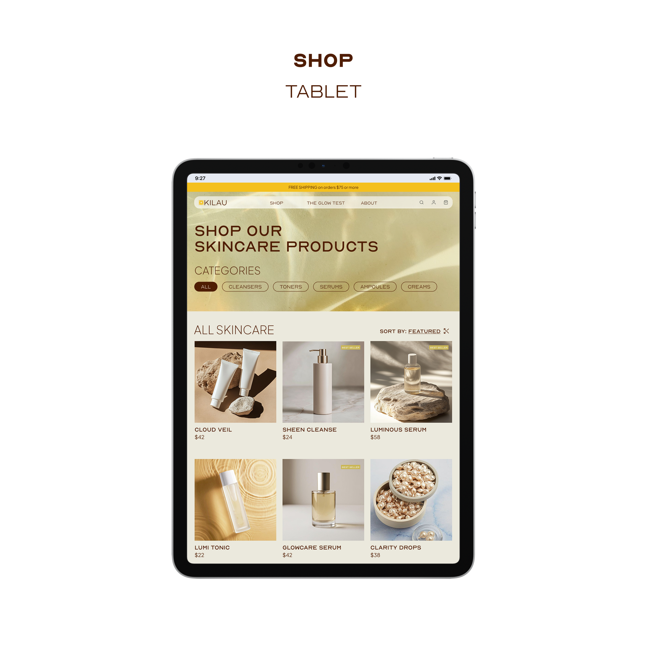
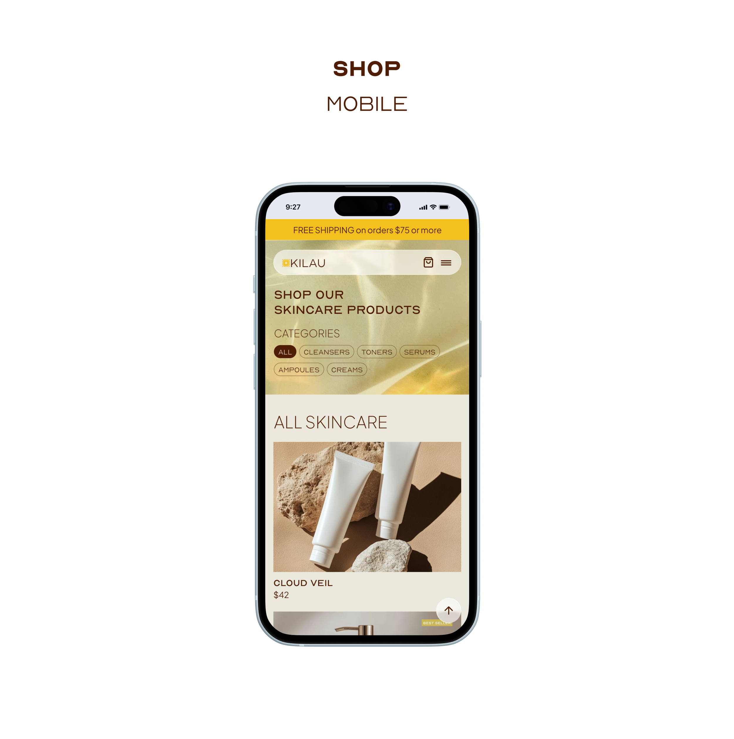
The IA was designed to optimize discoverability and flow. I prioritized a flat navigation structure that allows users to toggle between "Shop by Category" and "Shop by Concern." This dual-pathway approach caters to both the "expert" user who knows what they need and the "novice" user seeking guided assistance.
Ideation & Iterative Design
After research was complete, sketching to get design ideas out was the first step. I drafted four key screens that users had the most trouble on. Pen to paper made all the difference in sparking ideas and getting started. This helped organize the research and my design ideas before designing in Figma.
OVERVIEW
The Final Solution
Core Features
Prototype
prototyping
the final solution
The KILAU platform provides a seamless, data-driven yet serene e-commerce experience, empowering users to master their skincare through science and technology.
Core features
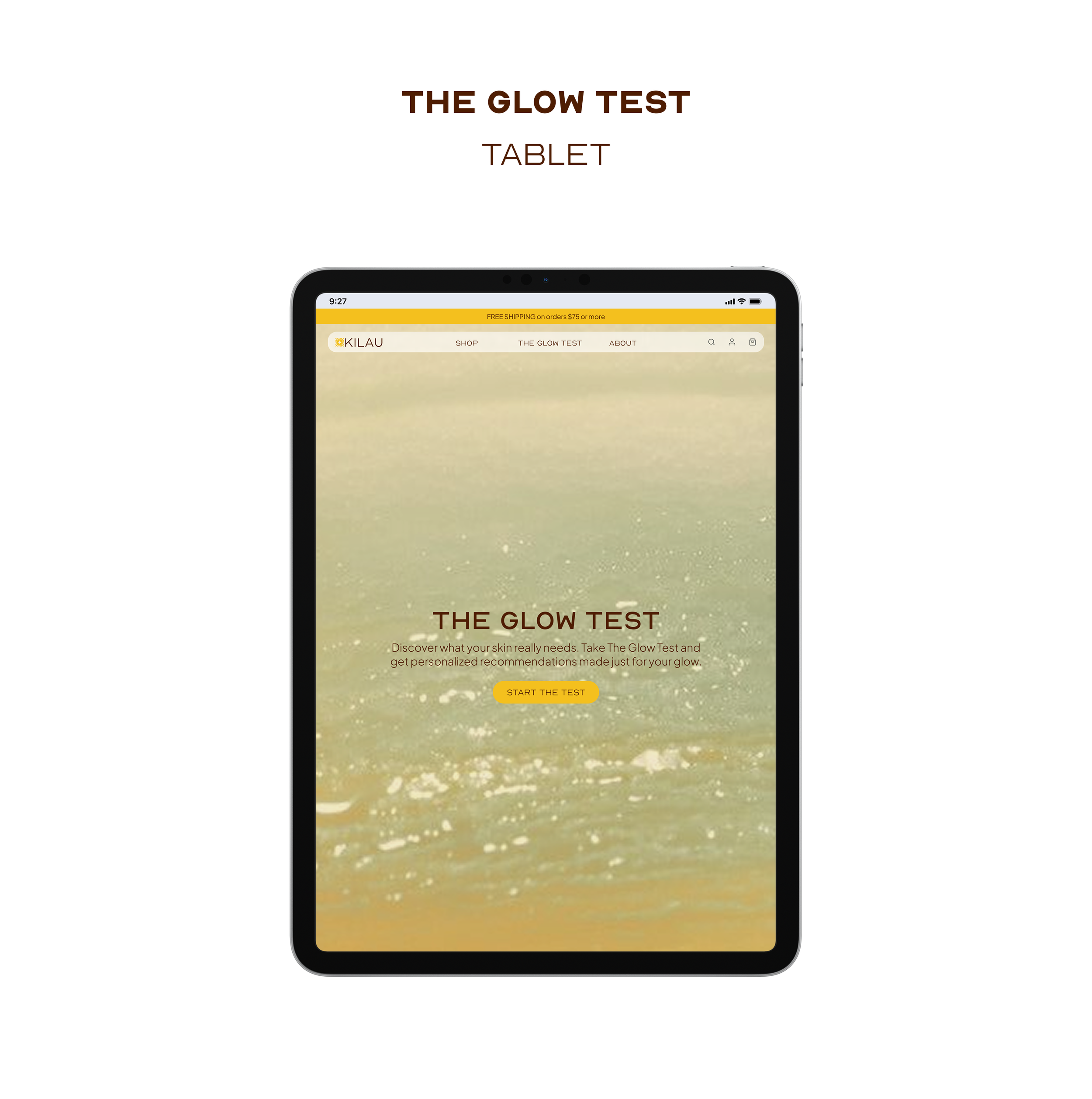
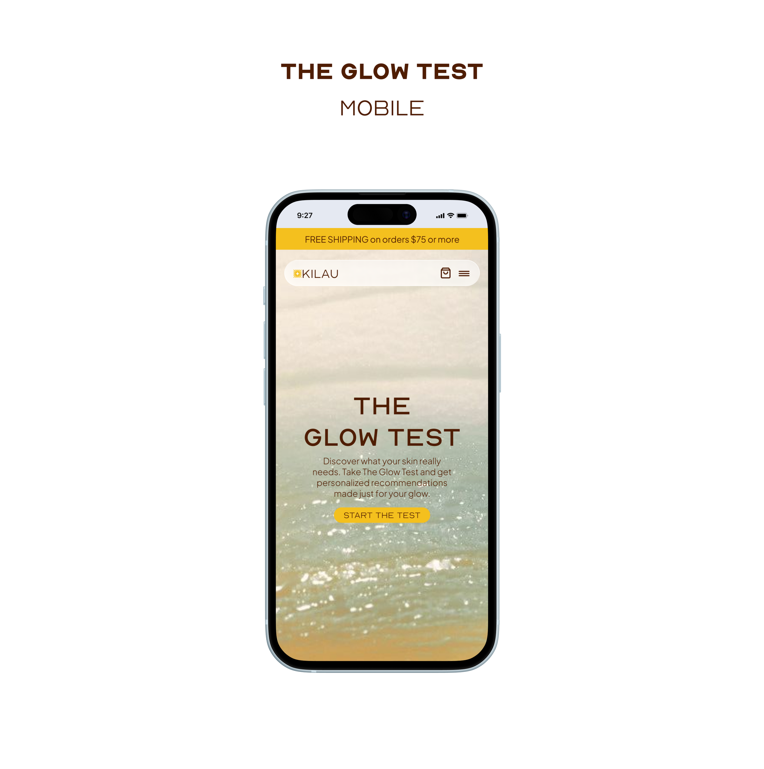
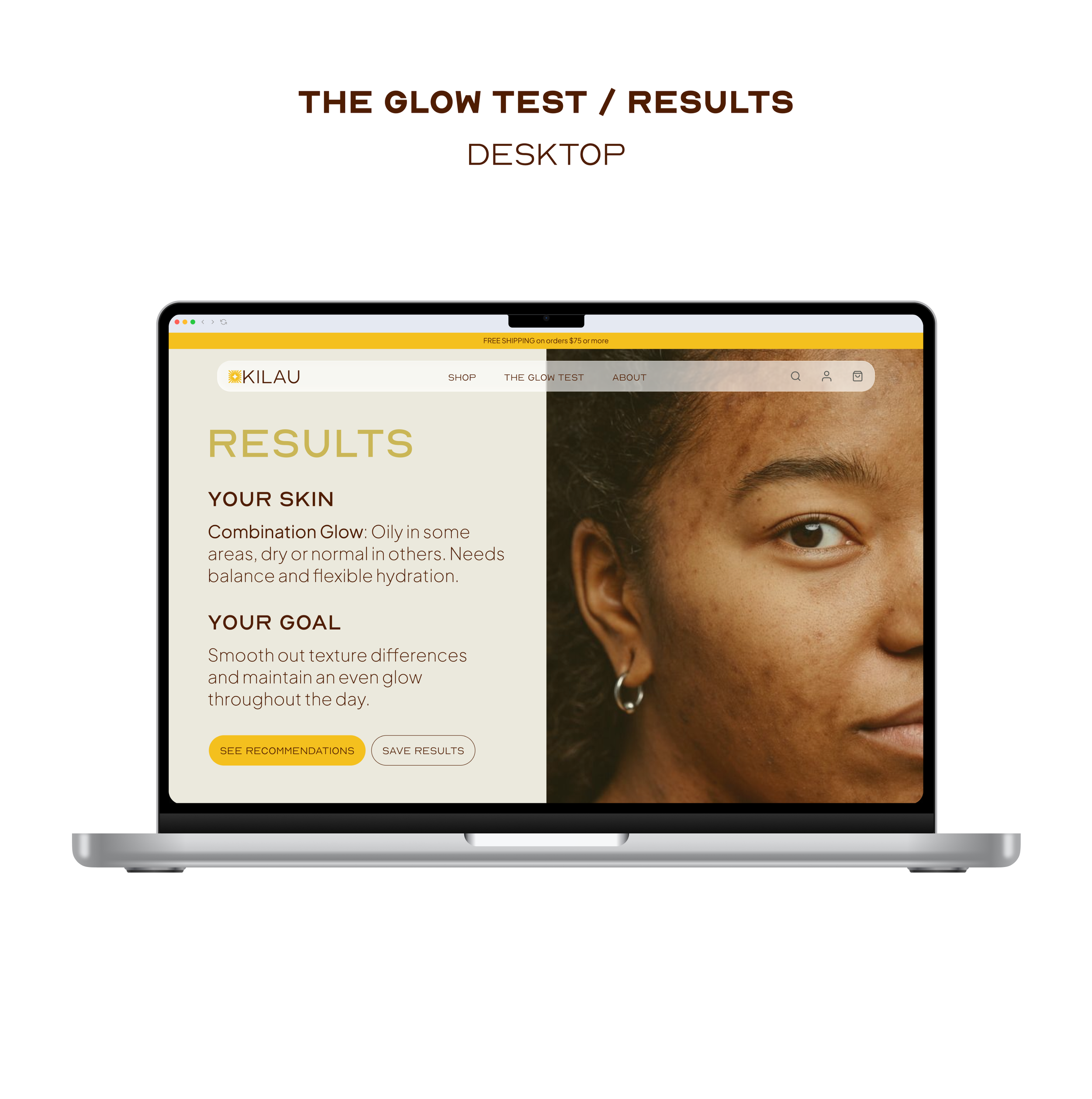
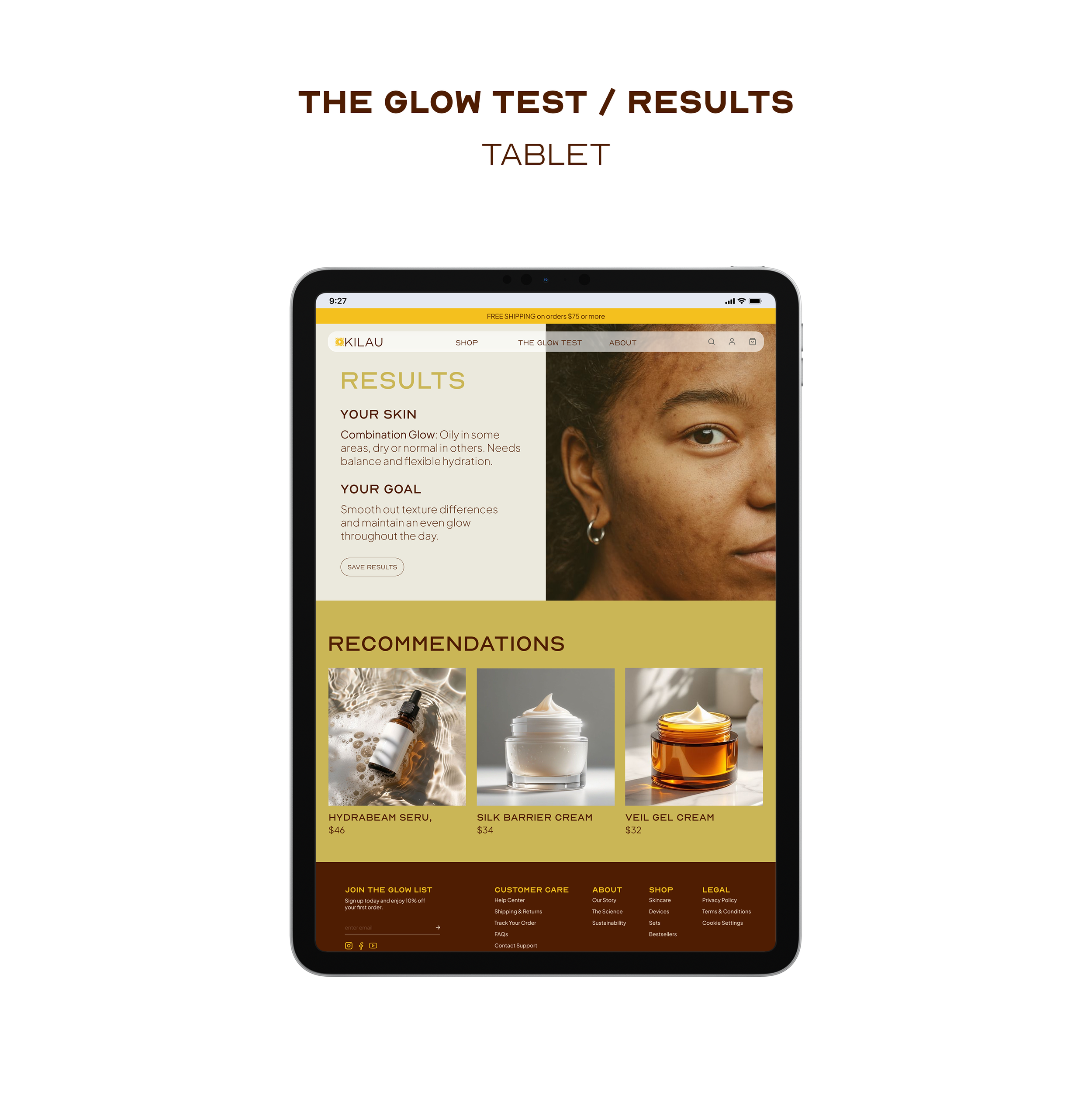
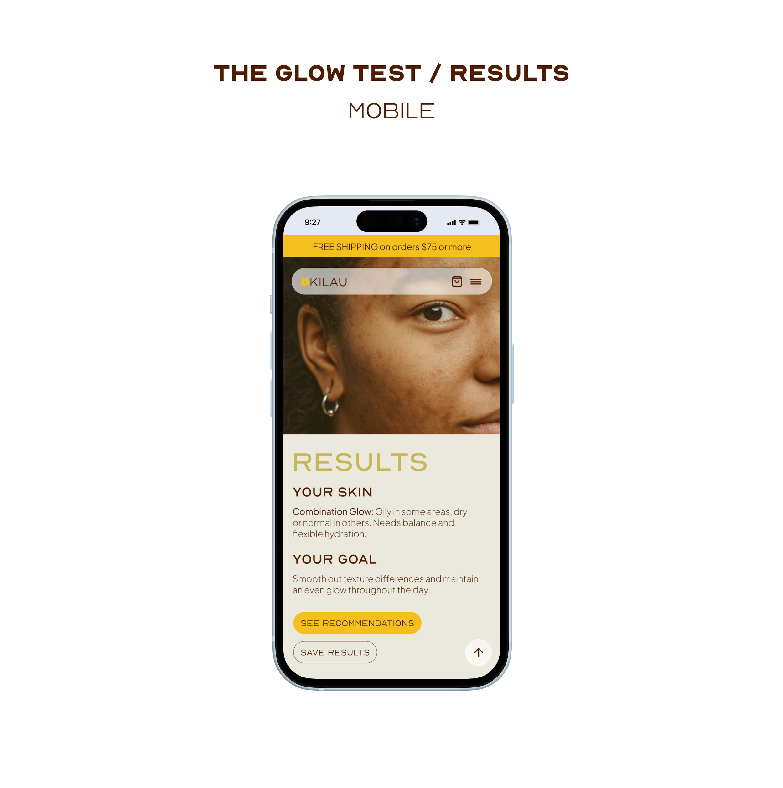
the glow test
A personalized diagnostic tool that removes the guesswork from product selection.
transparent ingredients list
Interactive modules that educate users on the "why" behind the science.
PLANNING BURNOUT
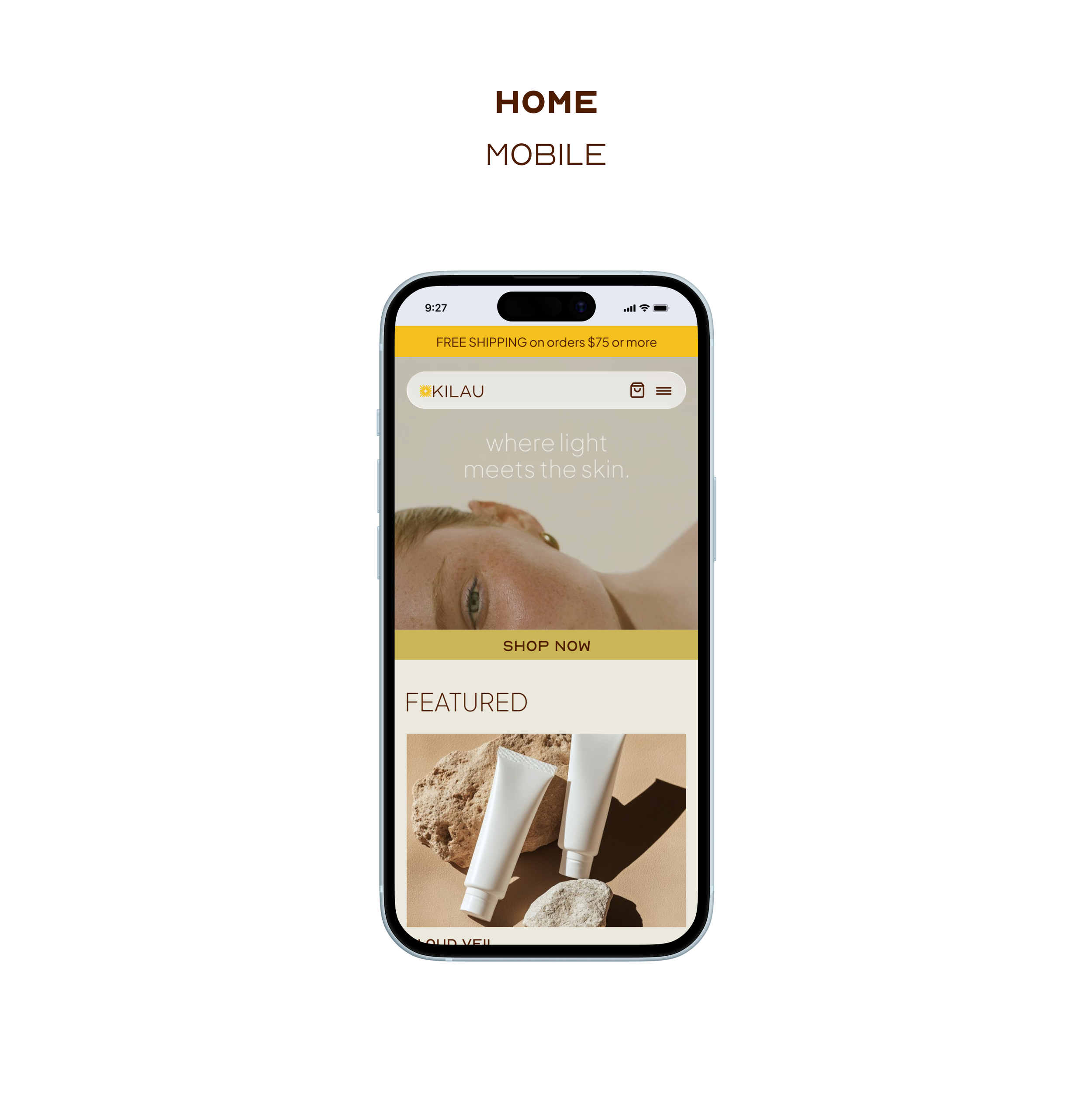
responsive interface
A high-performance layout that ensures a premium experience across all device classes.
smart tech integration
Detailed technical guides that simplify beauty hardware, lowering the barrier to entry.
By focusing on usability, clarity, and visual appeal, the platform transforms a routine purchase into an intentional ritual, encouraging users to invest in their skin health with confidence.
OVERVIEW
Retrospective
Reflect
Retrospective
This project reinforced the importance of user research and iterative design in creating meaningful digital experiences.
If I were to refine this project further, I would:
Expand User Testing: Conduct unmoderated usability testing with a broader demographic to validate the logic of "The Glow Test."
This case study showcases how human-centered interactive design can transform complex data into a compelling, user-friendly experience, bridging the gap between information and action.