
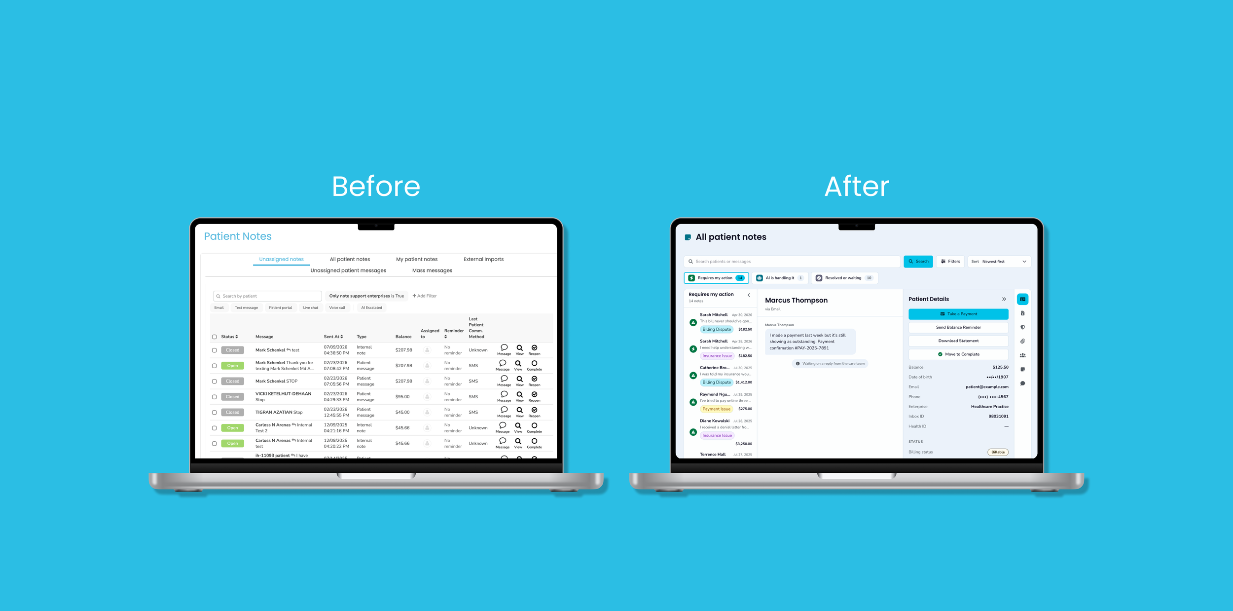
Billing dashboard
Inbox health | notes revamp
Inbox Health's Patient Billing Support (PBS) team and billers were working out of a flat notes table to organize patient questions or concerns. Every patient communication (SMS, email, live chat, internal notes) living in one undifferentiated list.
As AI began handling more first-touch responses, the table couldn't keep up. Status labels didn't mean anything to the people using them, there was no way to tell what the AI had already handled versus what needed a human, handoffs came with no summary of prior context, the layout worked against the actual flow of triage, and it wasn't clear who owned any given ticket.
The result: staff burned time context-switching and re-reading threads just to figure out what to do next.
ROLE
UX/UI Designer
TOOLS
Claude Code, Figma
TIMEFRAME
July 2026
The challenge
Give the PBS team a prioritized communications view organized around what actually needs their attention, so they stop falling back on the flat notes table to figure out what's going on.
Design process
OVERVIEW
Current Notes Page
Key Pain Points
Review project
Current Notes page
I audited the existing notes experience as staff actually use it, which is the notes queue, the patient detail view, and the in-context chat UI. Walking through these screens surfaced how much the current tool relies on a single flat table to represent every kind of communication.
Current Notes Queue
Current chat Ui
Key pain points
After reviewing the current experience end-to-end and revamps PRD, I mapped out pain points. The review included the notes queue, patient detail view, and chat UI in order to see how staff actually moved through it. That review surfaced five recurring pain points:
Status is meaningless
Labels in the notes queue don't tell staff anything about what to do next.
group chat chaos
No way to tell what AI already handled versus what still needs a person.
AI’s role is invisible
Handoffs lack context
Threads come with no summary, so staff re-read everything from scratch.
Current Patient Details
context switching
Staff bounce between views to piece together what's happening.
OVERVIEW
Tools + Approach
DEsign Research
Tools + Approach
OVERVIEW
AI Workflows
Ideate + prototype
AI Workflows
Using those findings, I prototyped in Claude Code using Artifact first before building out the design in the monorepo. This is where prompting and iteration became essential in building out my initial ideas. Throughout this process, I iterated five Artifact versions.
Prompts included providing project context, pain points, attached design inspiration and notes. Look below to see the early versions of the redesign.
OVERVIEW
Feedback Loops
Project Highlights
Redesign Demo
Client validation
Feedback loops
The Notes Revamp project was shown to two insurance biller clients to get their reaction on my redesign, truly understand how they interact with the Notes page, and confirm pain points. I also presented the project to Inbox Health’s AI product manager and head of PBS and received positive feedback.
Quotes + Feedback
-ascend
“I think that would make working through messages a lot easier… because then you could be right on just one screen.”
-ascend
“Biggest problem I have with notes today is that if multiple notes are initiated on a patient account, it's, very, difficult to go back and forth.”
-Blitz
“the result was what the product should have been all along.”
-AI Product manager
project highlights
The new design is organized around three buckets: what requires my action, what the AI is handling, and what's resolved or waiting. It uses three panes so you can focus, lets people customize their view. This also helps with the context switching pain point. Users now can have patient details stick side-by-side with the chat at all times. It also allows for a cleaner chat UI and it adds AI chat summaries so users don't have to read the whole conversation.
“I think this would make it a lot easier of a process to respond to those note."
Redesign demo
OVERVIEW
Retrospective
Reflect
Retrospective
Client calls ended up being one of the most valuable parts of this project. Sitting in on conversations with the PBS team and billers grounded the redesign in how people actually work, not just how the current tool assumed they worked.
Working with AI shaped the process just as much as it shaped the product. I used Claude to prototype early concepts before touching the monorepo (using Claude Code again), which let me iterate on the three-bucket structure and screen customization fast and test whether it actually simplified the process before investing in real components.