ROLE
Graphic Designer
TOOLS
Illustrator, Photoshop
TIMEFRAME
April - May 2025
judydoll packaging design
branding + Packaging Design
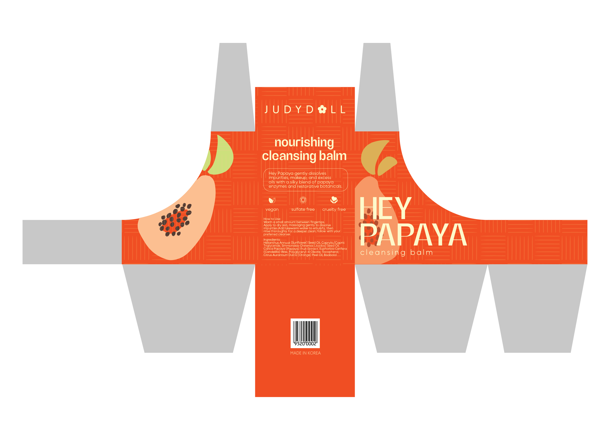
This project is a visual overview of the Judydoll Hey-Papaya Cleansing Balm packaging, centered on a tropical aesthetic and custom vector illustrations. The final deliverable is a high-fidelity, production-ready packaging system, elevating the brand’s presence in the retail skincare market.
The challenge
To revitalize the packaging for Judydoll’s Hey-Papaya Cleansing Balm with a fresh, youthful aesthetic that mirrors the brand’s playful energy. The original packaging lacked the "tropical vibrance" associated with its core ingredient: papaya.
Design process
OVERVIEW
Creative Mandatories
Target Audience
Define
Creative Mandatories
To ensure the redesign remained grounded in brand consistency while achieving a premium aesthetic, the project was guided by several essential creative requirements:
Brand & Product Identity: The packaging must prominently feature the Judydoll logo and the "Hey-Papaya" product name, maintaining a clear typographic hierarchy between the brand and the specific balm variant.
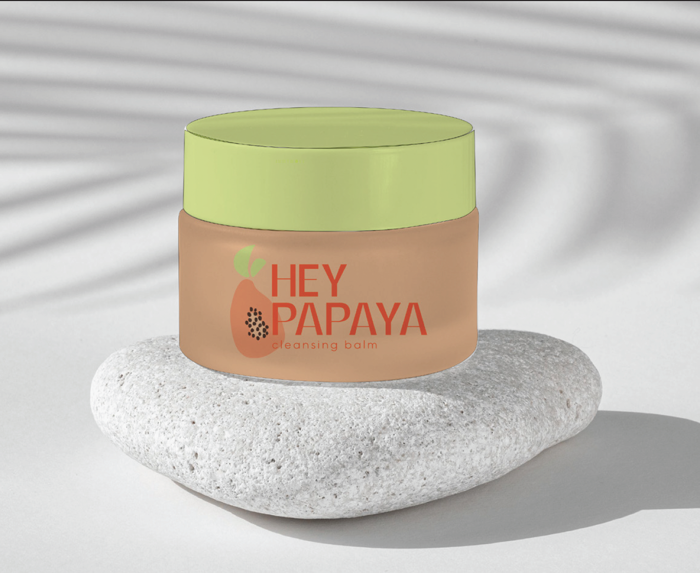
Core Iconography: Custom vector illustrations of papayas and tropical leaves are required to visually communicate the "fruit-forward" nature of the formula
Mandatory Disclosures: The layout must accommodate high-density information, including a full ingredient list, "How to Use" instructions, the "Made in Korea" designation, and the "Vegan, Sulfate-Free, and Cruelty-Free" certifications.
Target audience
Modern, skincare-conscious consumers who value "fruit-forward" products and a fun, effective cleansing ritual. The design needed to feel both professional (science-backed) and approachable (lifestyle-oriented).
OVERVIEW
Approach
Color Studies
Typographic Studies
Sketching
ideate
approach
The ideation phase began with a deep dive into tropical visual directions and color exploration.
Color studies
I experimented with a palette of sun-drenched oranges, soft creamy yellows, and vibrant magentas to evoke the ripening stages of a papaya.
Competitive analysis
typographic studies
I tested a variety of typefaces, looking for a balance between "playful energy" and "clinical clarity." The final selection prioritized a modern sans-serif for high legibility against the organic shapes of the fruit illustrations.
Used Typefaces
typographic arrangements
sketching
Initial sketching focused on the placement of the papaya graphic and packaging shape—exploring how the leaves and fruit could wrap around the container to create a dynamic 360-degree experience. Sketches also explored unconventional packaging shapes.
OVERVIEW
Version 1
Version 2
Version 3
DESIGN
version 1
In the design phase, I moved from low-fidelity sketches to high-fidelity digital compositions in Illustrator.
For Version 1, I experimented with different typographic arrangements to establish a strong visual hierarchy. However, I struggled to develop a cohesive color palette and found it challenging to effectively utilize the space on the back of the packaging.
Feedback
The graphic and typography lockup on the front lacked visual impact
Muted color palette failed to capture the energy and appeal needed to resonate with a younger target audience
version 2
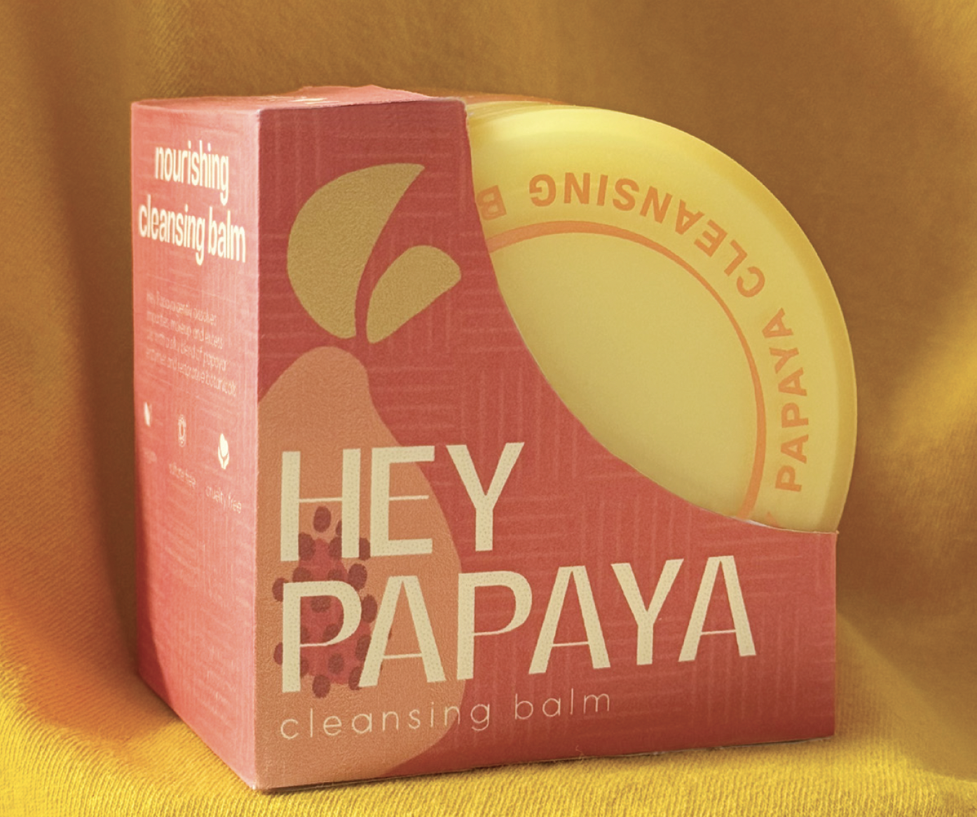
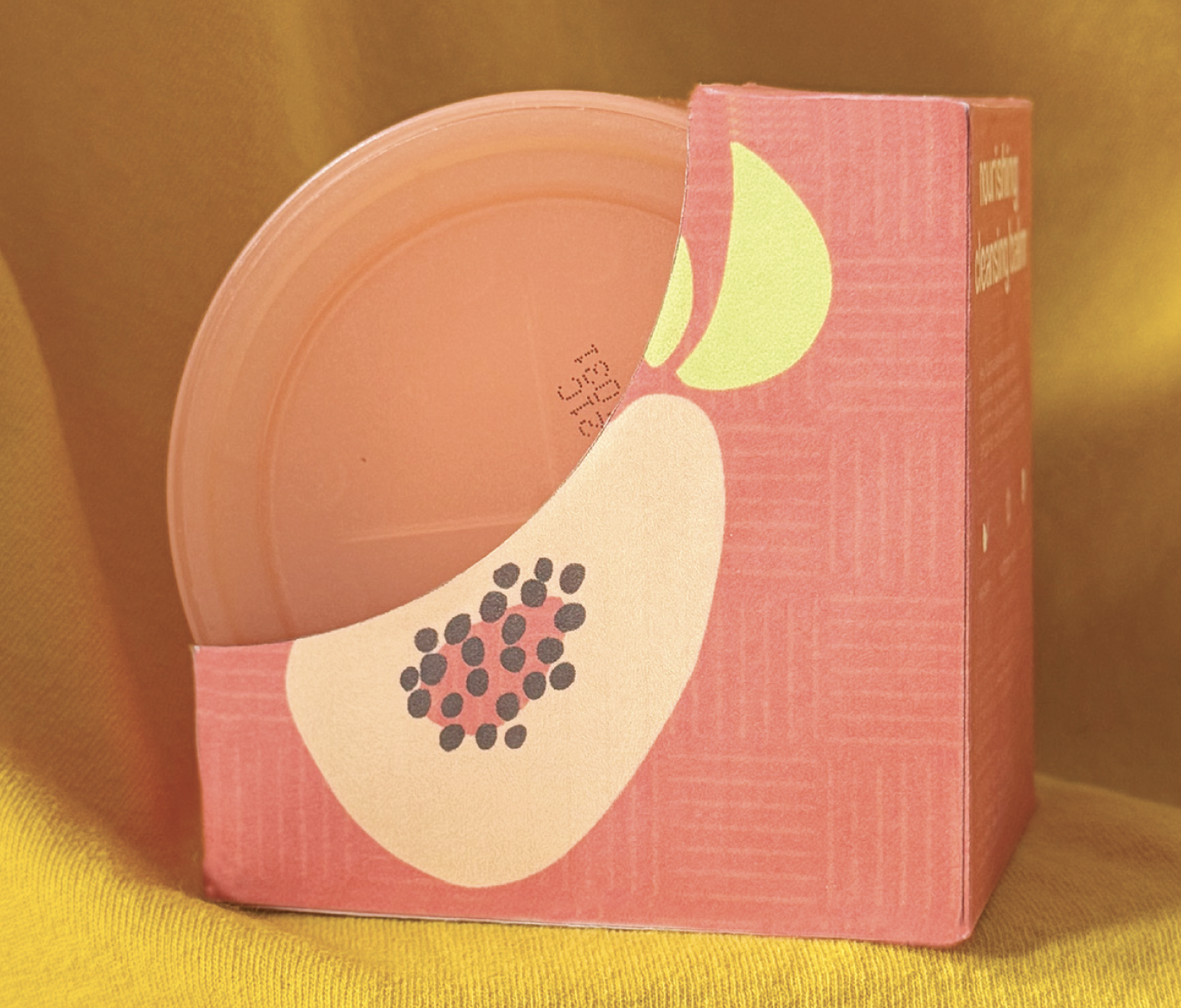
For the second version, I explored using the papaya graphic as a more prominent design element by integrating it into the product title on the front. To create a sense of movement and playfulness on the back, I had the papaya graphic bleed off the edge, which helped fill space more dynamically. The top portion of the design remained a challenge due to the unconventional dieline, but overall, this version presented the strongest visual direction. The updated color palette felt vibrant and fresh, making it the most successful in capturing the brand’s youthful energy.
Feedback
The curved “Cleansing Balm” lettering is difficult to read, the papaya didn’t read as an “A”
Increase the type size on the back for improved readability and visual balance.
Use the papaya graphic more effectively on the front by allowing it to bleed off the edge, creating consistency with the playful layout on the back.
version 3
For Version 3, I explored an entirely different direction aimed at creating a more premium and luxurious look. I introduced a serif typeface to evoke elegance and shifted the visual style from abstract to more realistic papaya illustrations. Inspired by packaging references that used gradients, I incorporated a similar approach to enhance the overall aesthetic. I continued to face challenges with the empty space at the top of the packaging, so I addressed this by designing a circular, badge-like lockup featuring the words “Cleansing Balm,” centered around the papaya graphic for balance and visual interest.
Feedback
Version 3 is the least effective design overall — the gradient treatment feels out of place and doesn’t translate well on this packaging format
The serif typeface doesn’t align with Judydoll’s playful and youthful brand identity
The badge-style lockup lacks clarity and impact
OVERVIEW
Feedback
Final Round
iterate
This project relied heavily on iterative feedback loops to transition the design from "flat" to "premium." After the first round of feedback, Version 1 was selected. After refinement, more feedback was shared.
Feedback
Critique indicated that the packaging still felt "flat" in terms of perceived materiality.
The initial comps were functional but lacked depth, making the packaging appear one-dimensional.
Refinement: To address the empty space and legibility issues, I enlarged the papaya leaves to extend into the top margins and lowered the opacity. This created a subtle, tone-on-tone effect that added visual interest without sacrificing text clarity.
final round
After the second round of feedback, the packaging was coming together. However, it still felt flat. To resolve this, I added a subtle texture to add a pop of color and stylize the orange. The pattern contributed to a tropical feeling.
OVERVIEW
What I Took Away
The Final Solution
reflect
This redesign successfully bridges the gap between functional information and emotional branding. By focusing on the "tropical essence" of the product, the new packaging reinforces Judydoll’s promise of a fun, effective skin-loving ritual.
what I took away from the process:
Materiality Matters
Adding a subtle texture transformed the digital design into a product that feels tangible and premium.
brand storytelling
This case study demonstrates how intentional color and illustration choices can transform a simple transaction into a compelling brand journey.
PLANNING BURNOUT
legibility is key
Using opacity adjustments allowed for large graphics to exist with dense information without creating cognitive overload.