Paris Baguette
Mobile App Redesign
Project Overview
ROLE: UX DESIGNER | SCOPE: JAN–FEB 2026 | TOOLS: FIGMA
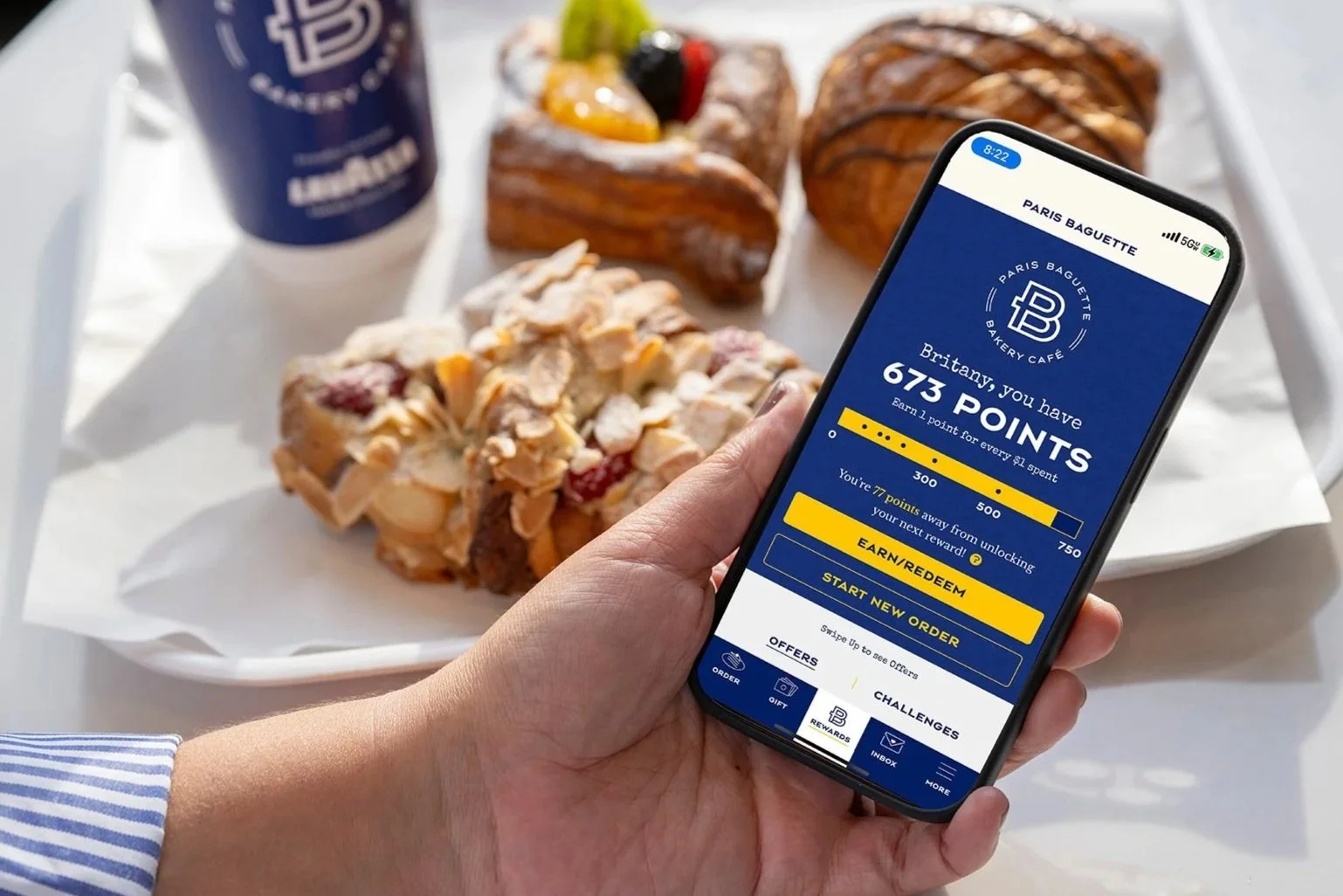
Paris Baguette is a premier, French-inspired bakery cafe with an international presence, known for its high-quality cakes and pastries. Despite the brand's premium physical atmosphere, the mobile application struggled with significant user friction, brand misalignment, and navigational complexity. My mission was to transform the app from a "generic utility" into a sophisticated digital experience that mirrors the in-store environment.
The Challenge
To unite the gap between the in-store experience and a complicated digital product.
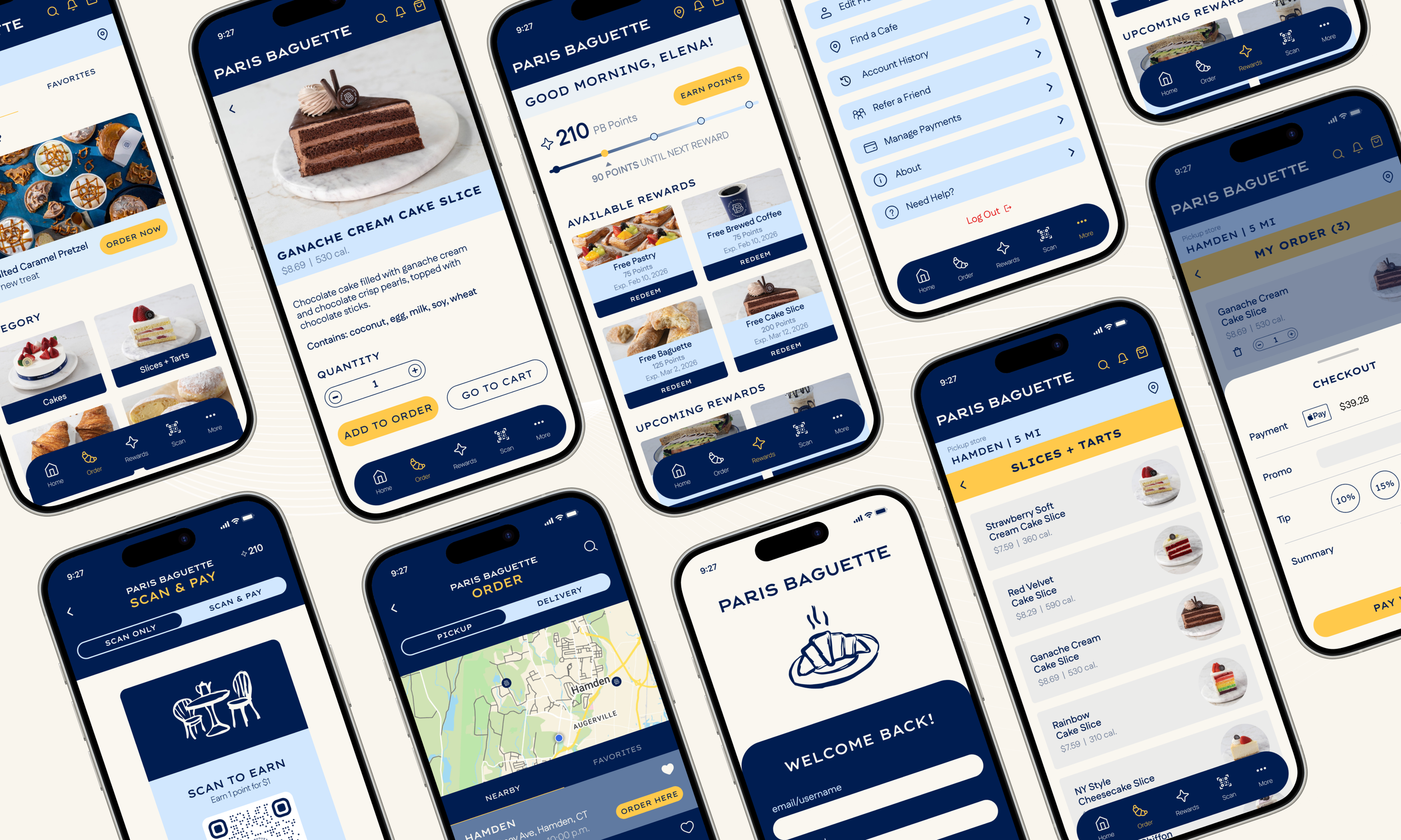
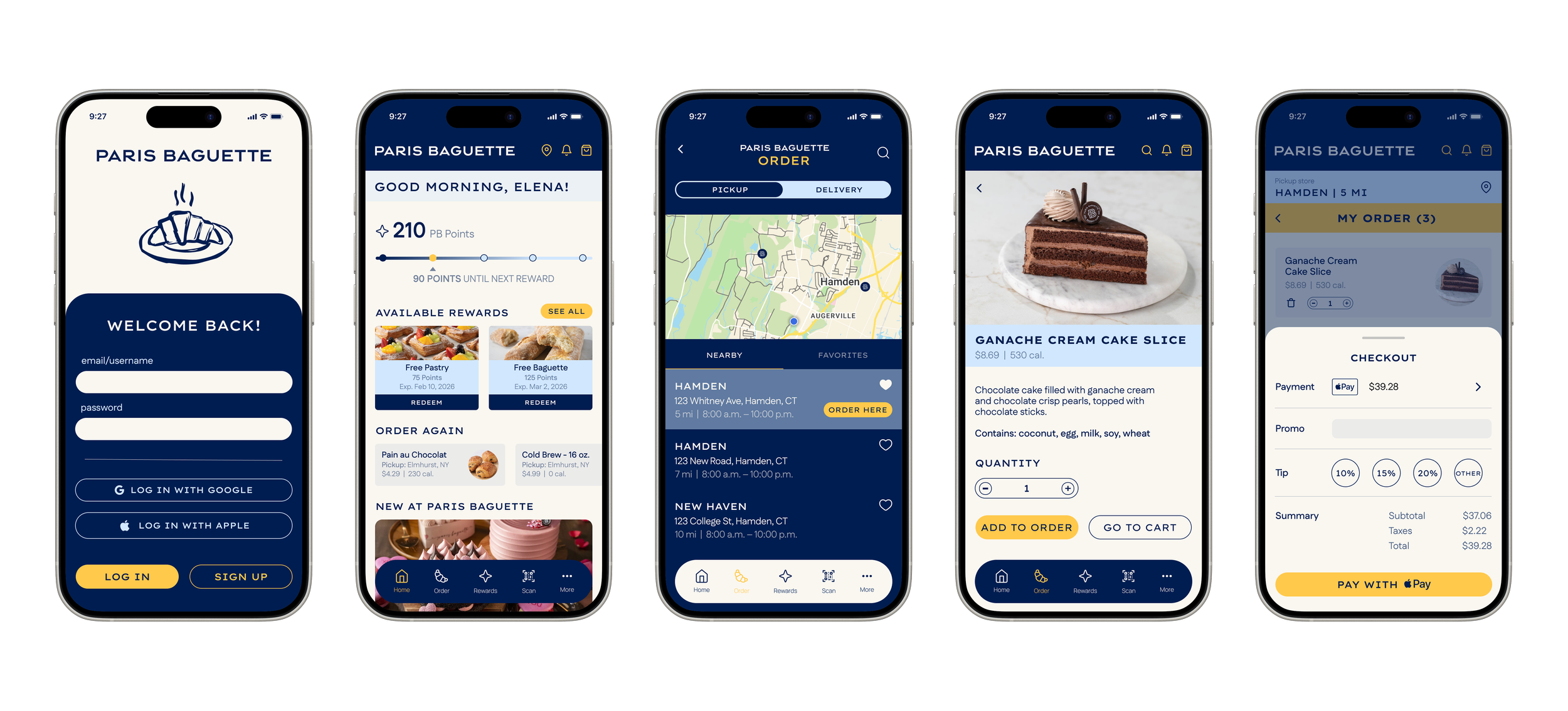
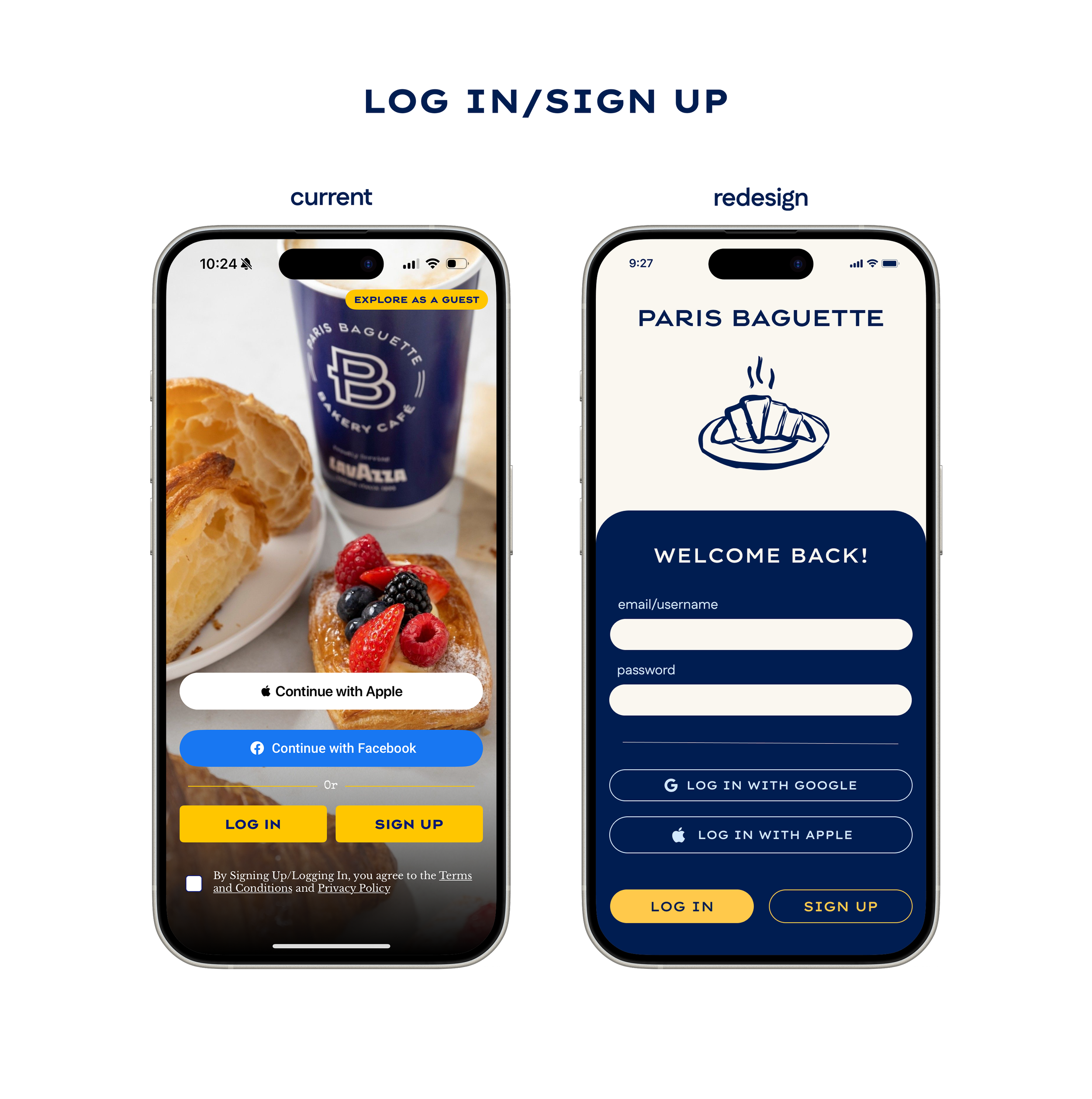
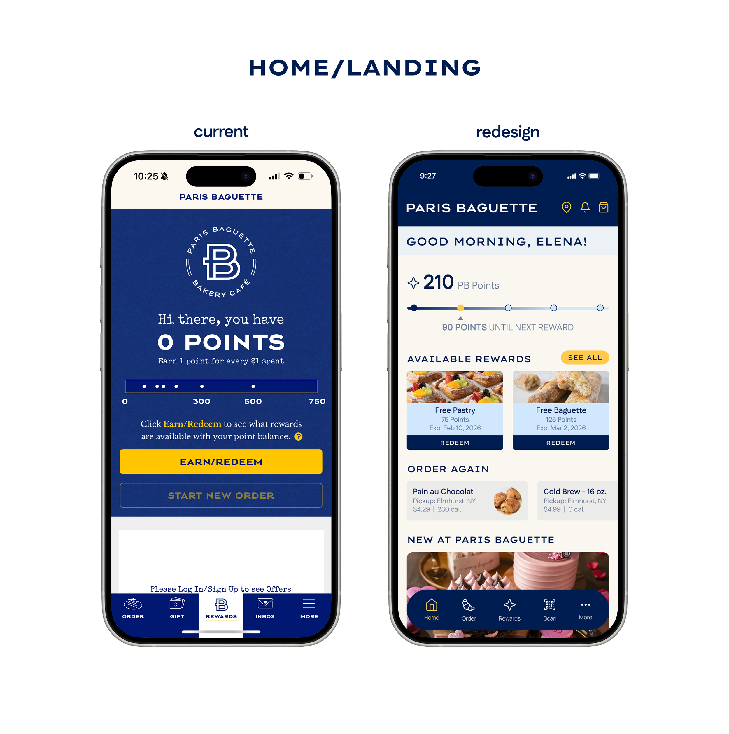
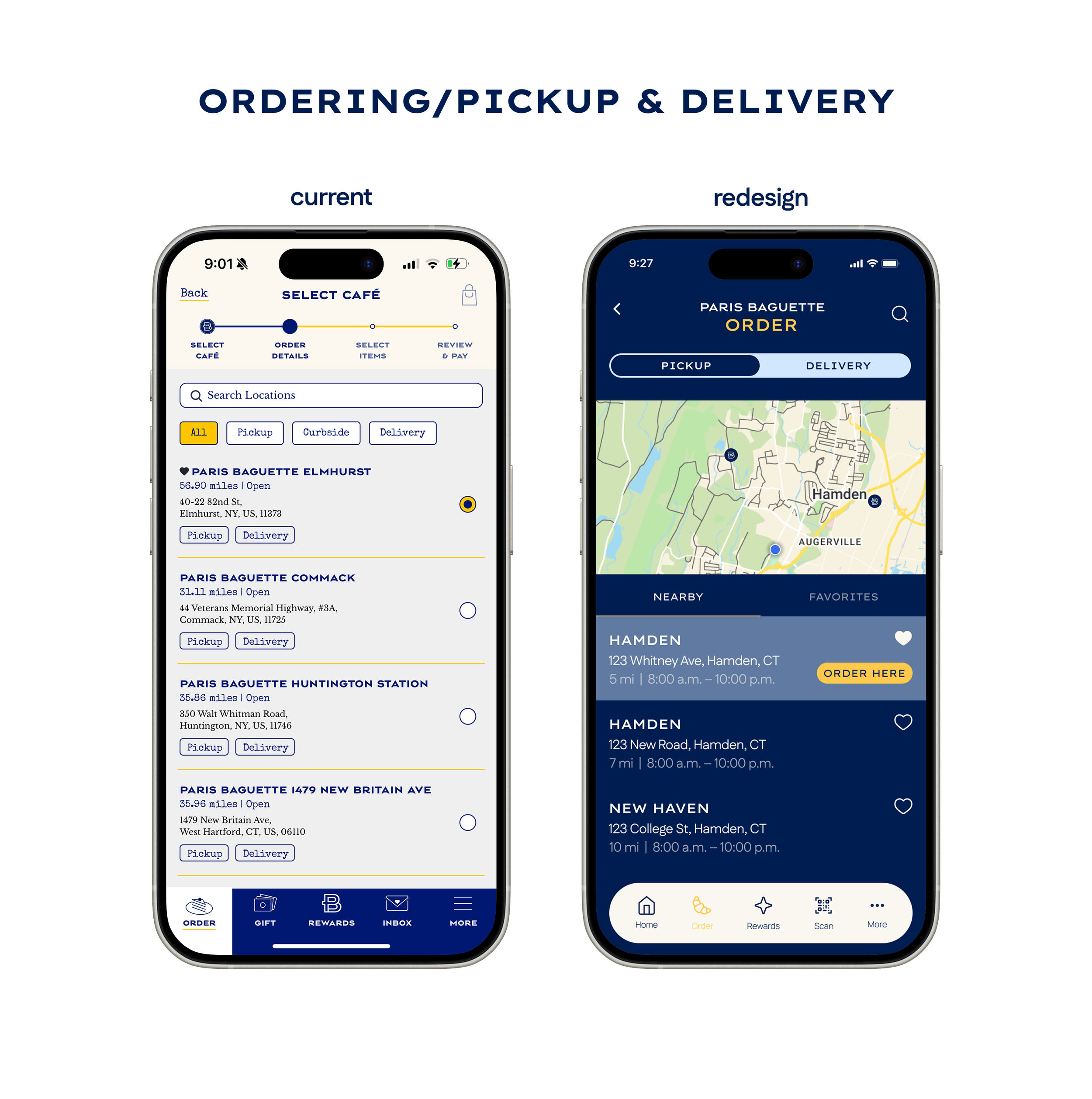
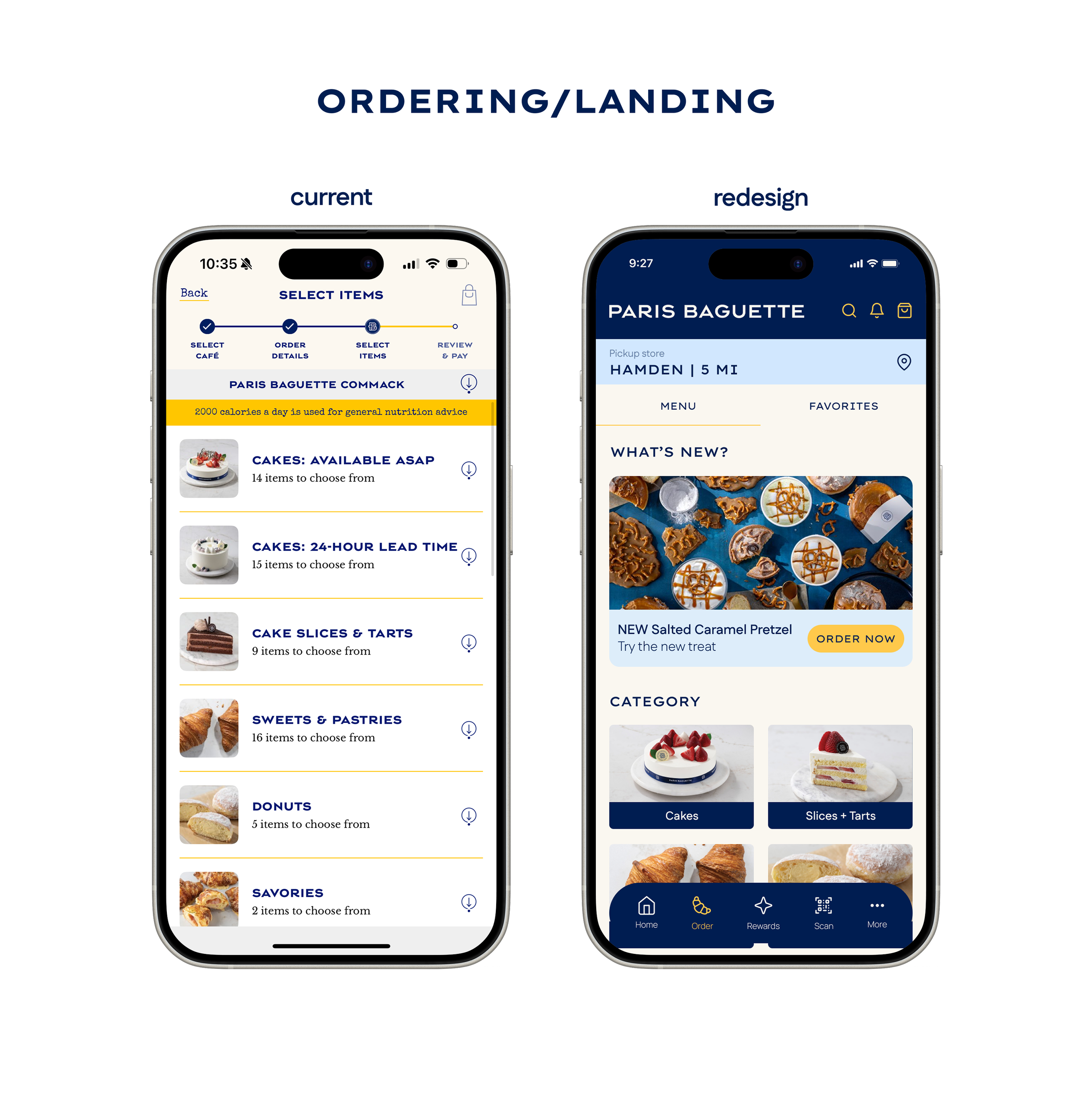
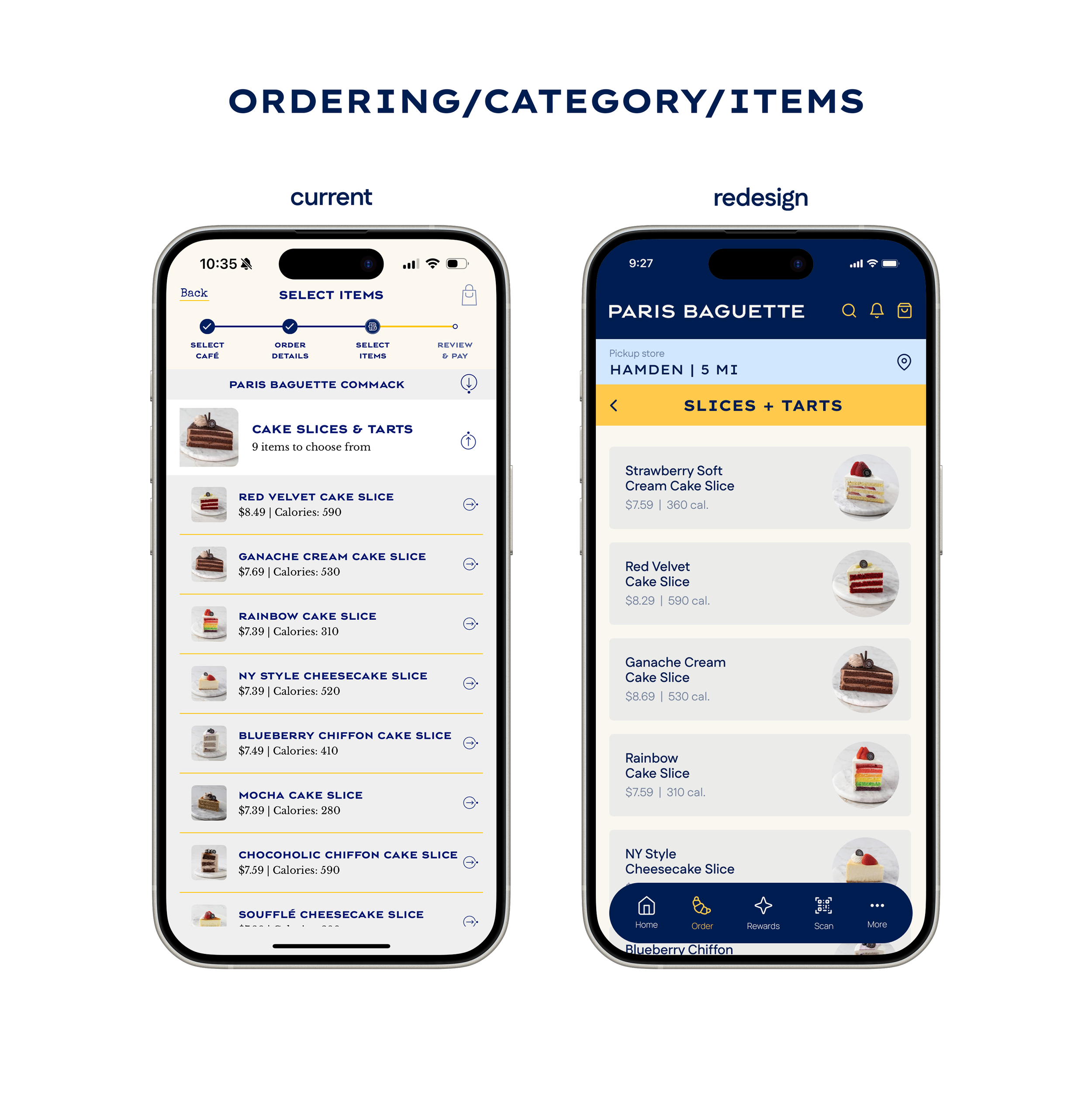
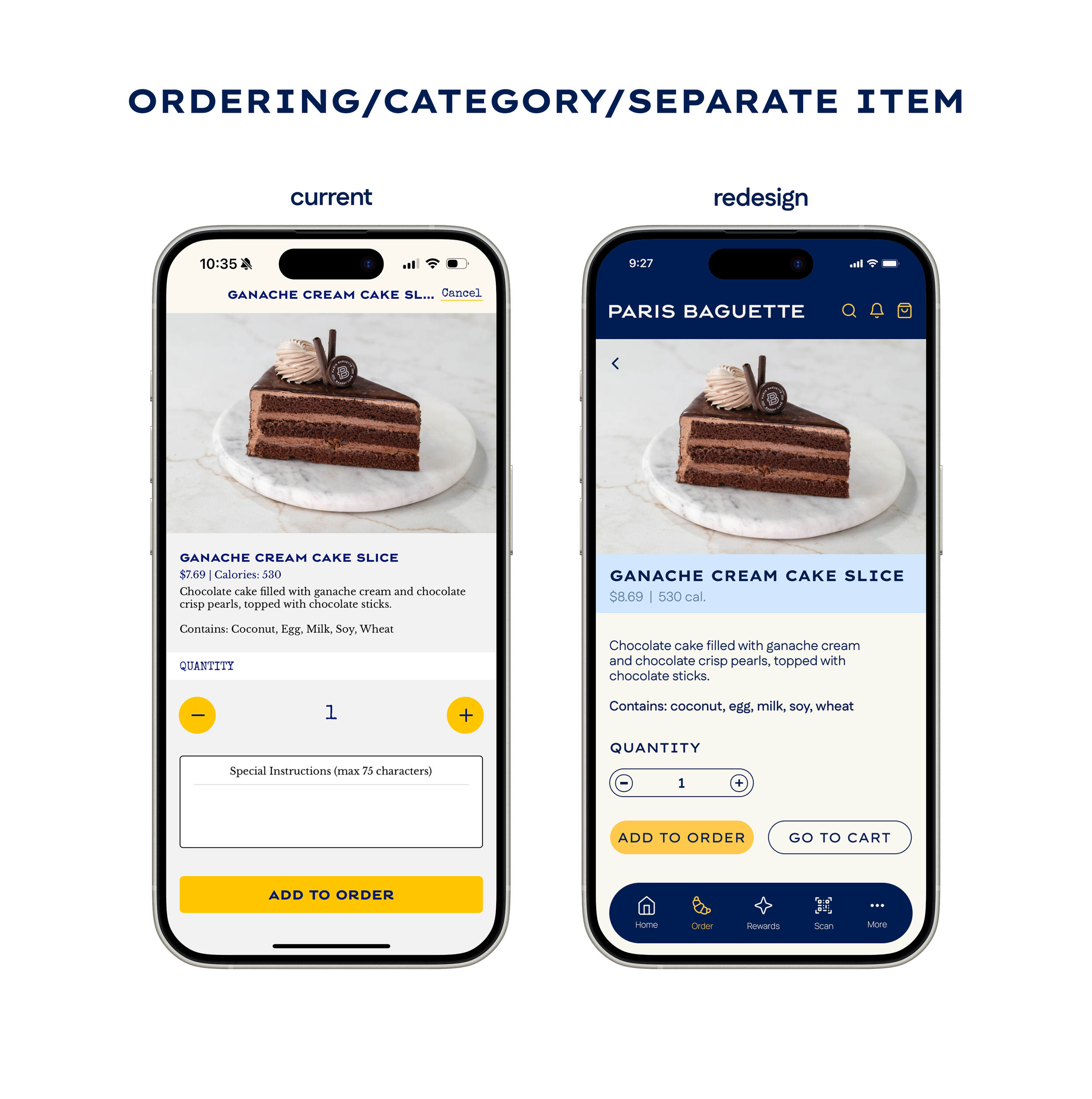
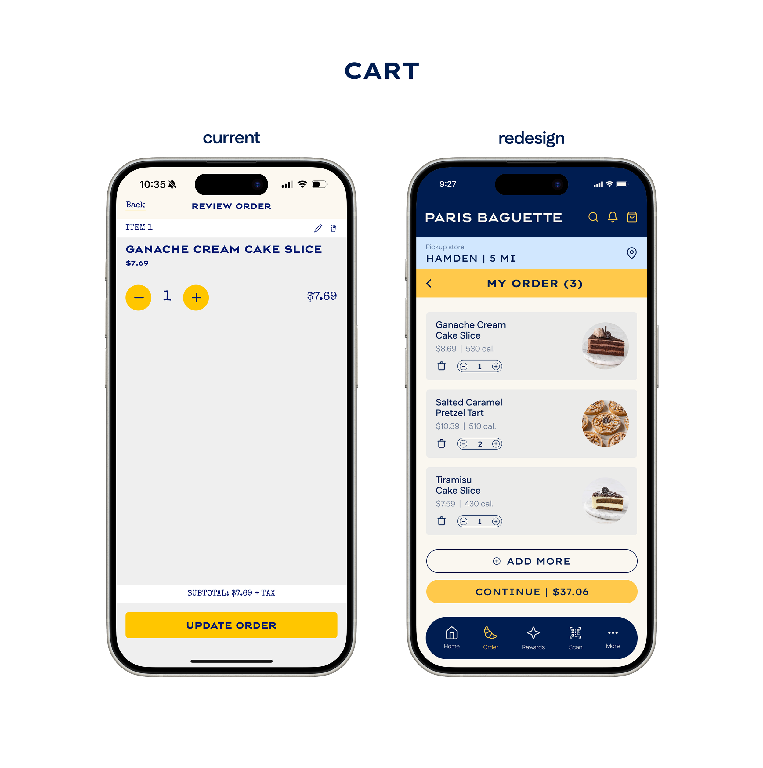
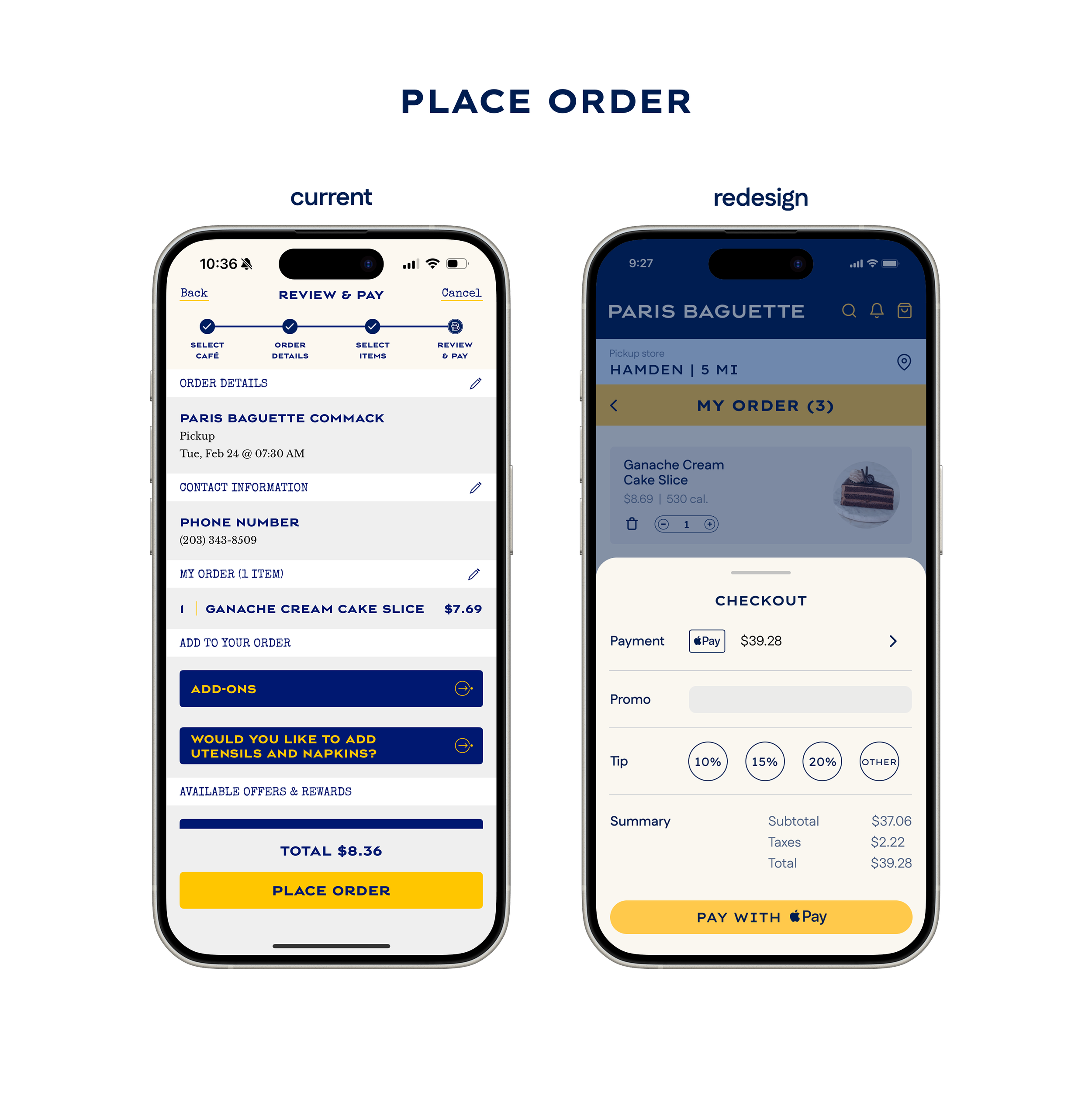
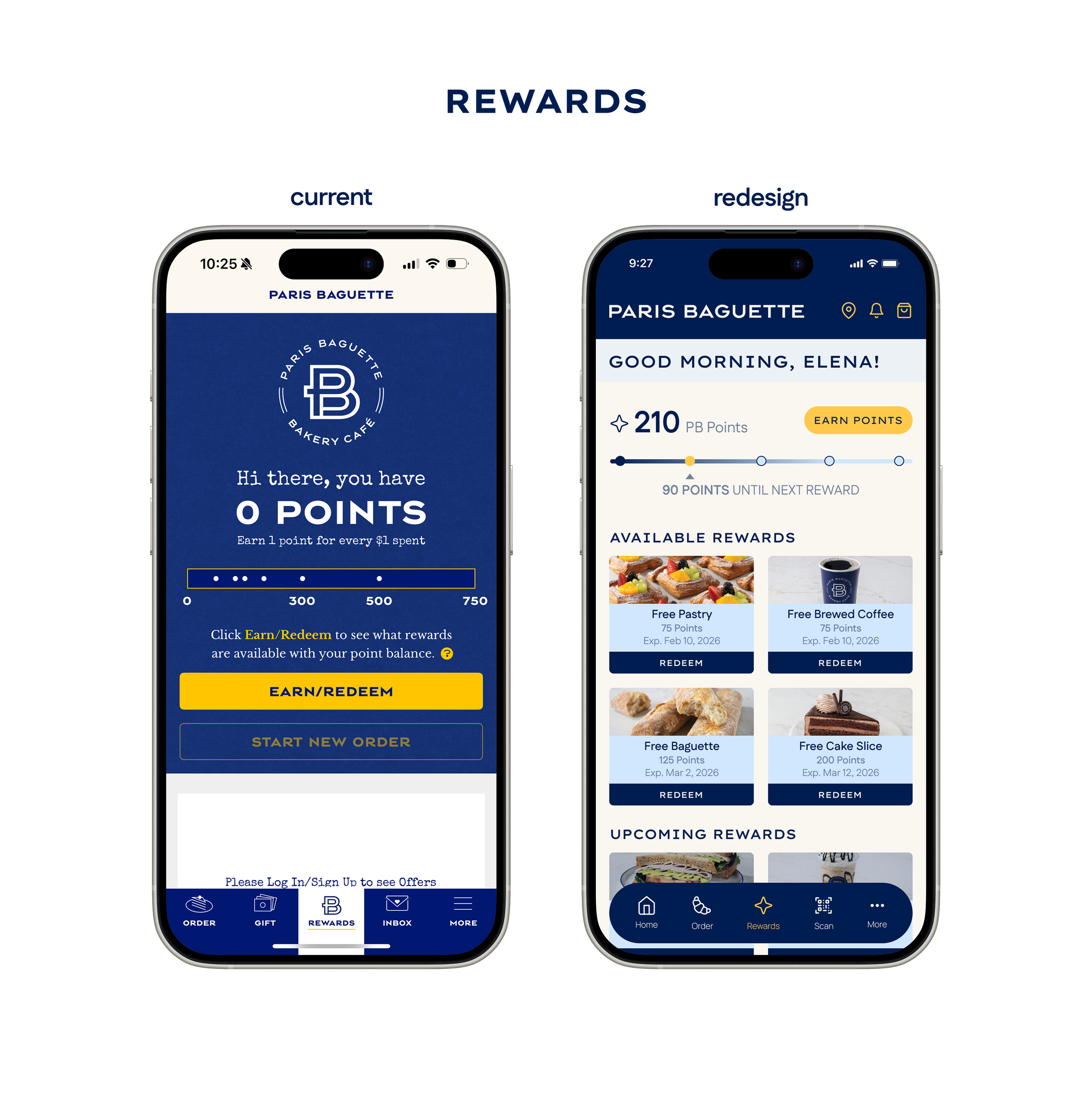
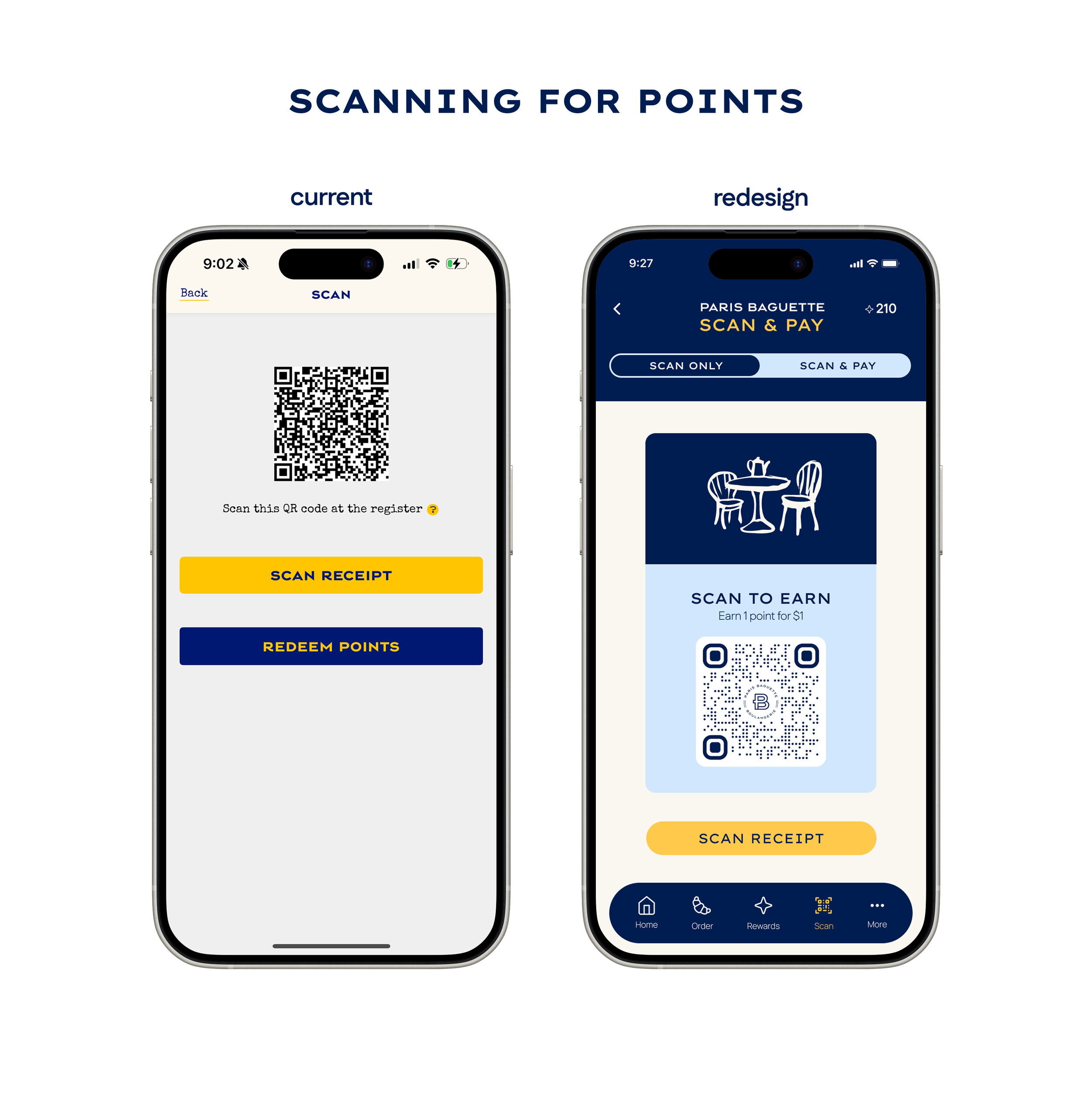
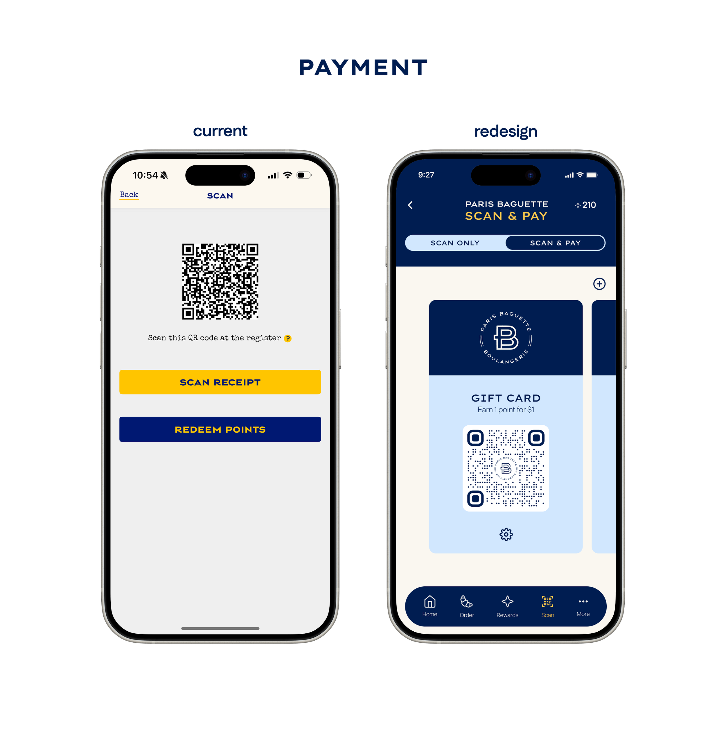
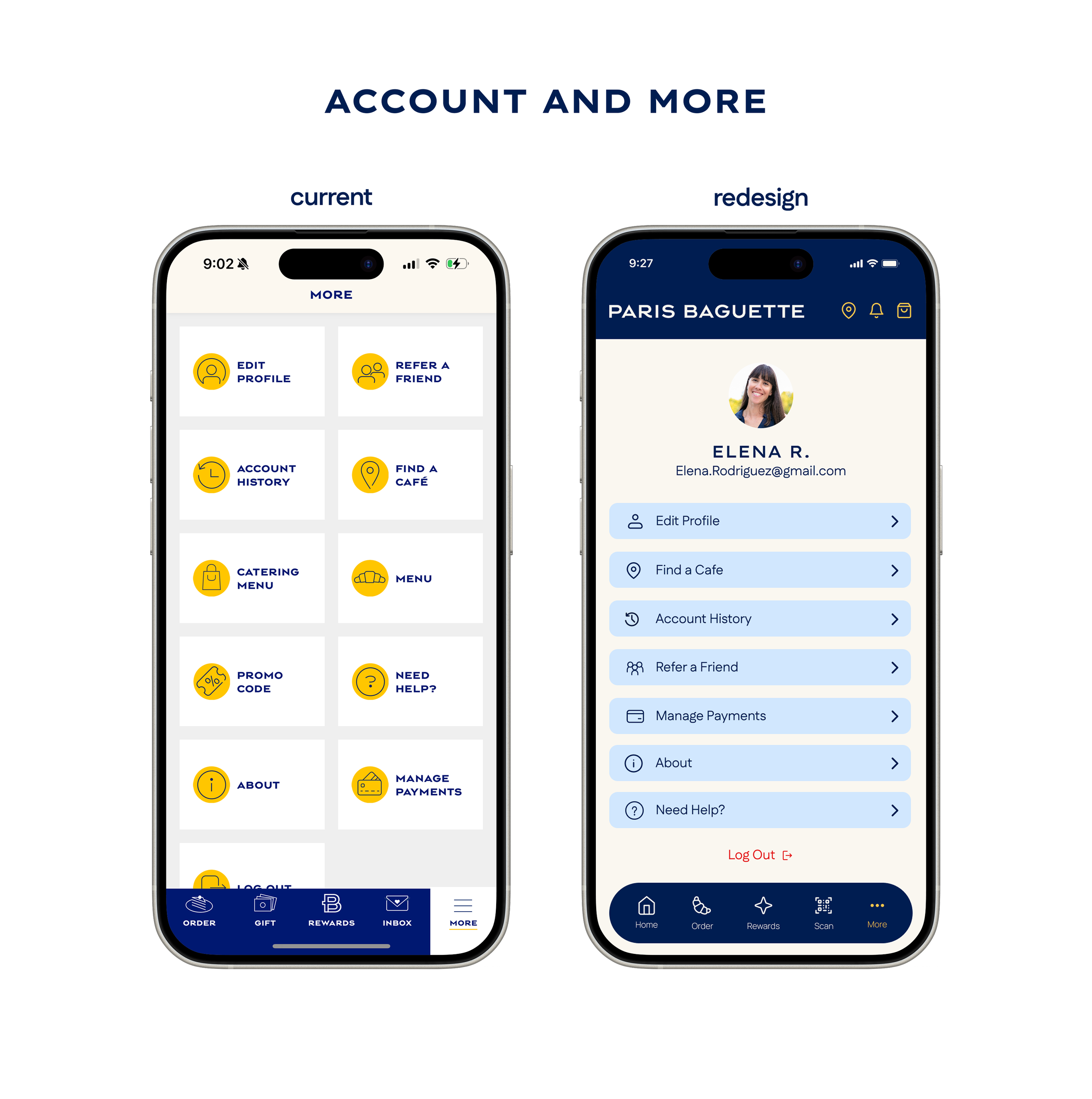
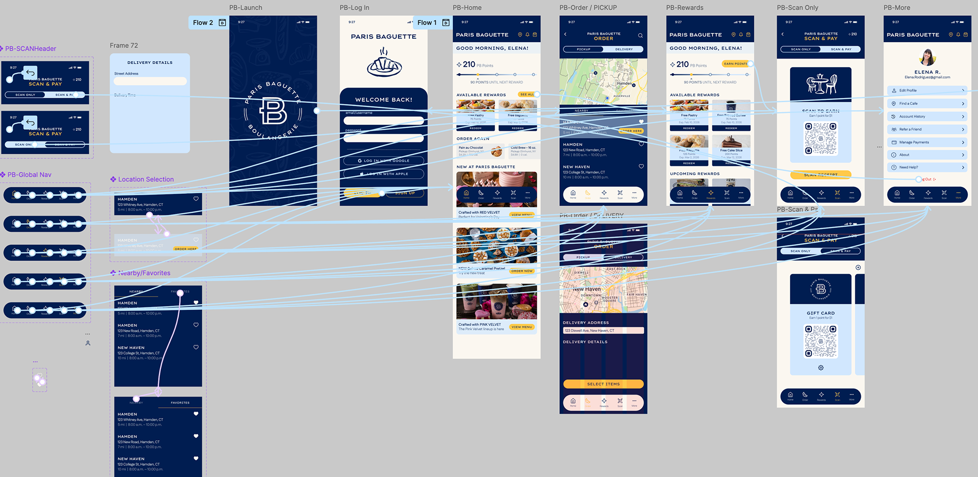
Key redesign screens
User research + insights
To identify why the existing application failed to meet its brand promise, I conducted a qualitative research study featuring 15 targeted interview questions. This deep dive explored the end-to-end user journey, helping me map mental models and identify critical pain points. I tested both "power users" and "novice users" to ensure a diverse perspective on the app’s usability.
key research findings
BRAND DISCONNECT
80% of users felt the app didn't match the bakery's premium aesthetic.
NAVIGATIONAL LOOPS
Users felt "ticked off" by a disappearing navigation bar and lack of "Back" functionality.
THE “ACCOUNT WALL”
Mandatory Terms & Conditions and poor error handling during signup led to immediate frustration.
REWARDS SYSTEM
Users feared losing points by clicking "Redeem" without an immediate checkout. Rewards system logic was unclear.
affinity diagram
To synthesize the user research, I developed an Affinity Diagram to cluster pain points into actionable items. The analysis revealed a significant Brand Disconnect, where a "generic utility" feel failed to mirror the premium in-store experience. Key clusters included Onboarding Friction , Transactional Bloat from an excessive number of taps to order , and Redemption Anxiety caused by an unclear rewards system. This process transformed observations into a strategic roadmap for the UI redesign.
user personas
The creation of user personas are to visualize an understanding of potential users. Based on the responses and key insights from the user interviews, two personas were created to mimic realistic core needs, frustrations, and personalities. This information will guide the user flows, information architecture, and overall design.
user flows
To streamline the user journey, I mapped out four critical paths: Onboarding/Authentication, Product Discovery/Ordering, Checkout Optimization, and Loyalty/Rewards Integration. These flows allowed me to account for various entry points, decision nodes, and system states to ensure a seamless end-to-end experience.
information architecture
The IA serves as the structure of the experience. Based on user insights, I redesigned the Global Navigation to prioritize high-intent actions: Home, Order, Rewards, Scan/Pay, and Account. I utilized the L.A.T.C.H. (Location, Alphabet, Time, Category, Hierarchy) and S.L.I.P. (Sort, List, Index, Path) methods to organize the menu, ensuring that the bakery’s vast catalog remained discoverable but not overwhelming.
Ideation & Iterative Design
After research was complete, sketching to get design ideas out was the first step. I drafted four key screens that users had the most trouble on. Pen to paper made all the difference in sparking ideas and getting started. This helped organize the research and my design ideas before designing in Figma.

The final solution
The redesigned Paris Baguette mobile experience provides a sophisticated, frictionless journey that honors the brand’s premium identity while delivering a data-rich, intuitive interface.
Core features
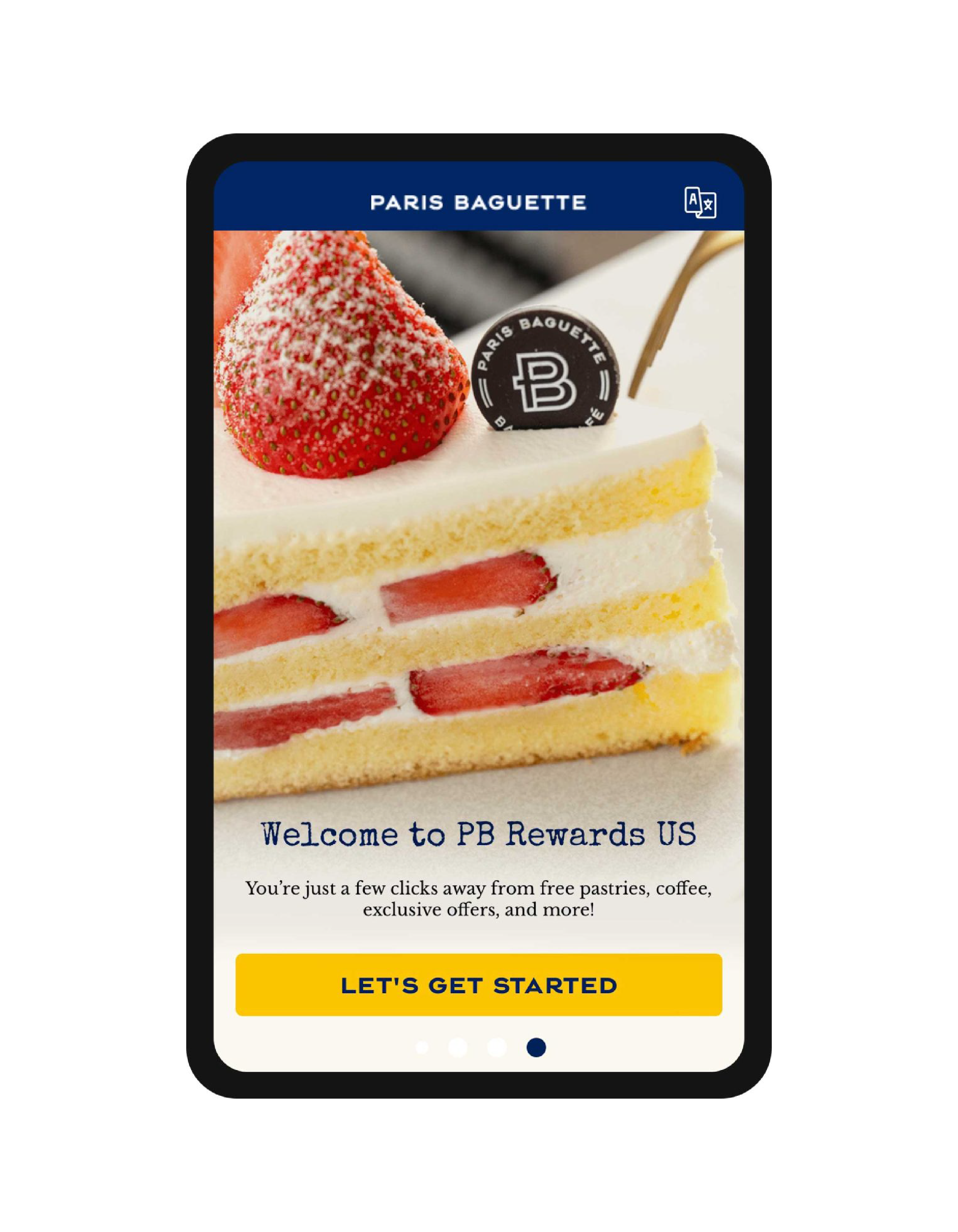
REIMAGINED ONBOARDING
Eliminated the "Account Wall" in favor of a guest-friendly exploration mode, reducing initial friction.
TRANSPARENT REWARDS LOGIC
Eliminated the "Account Wall" in favor of a guest-friendly exploration mode, reducing initial friction.
PERSISTENT NAVIGATION
A redesigned global nav bar that follows established UI heuristics, ensuring users never feel "lost" in the app.
ELEVATED VISUAL LANGUAGE
A modernized UI kit that uses high-quality imagery and elegant typography to mirror the in-store "French-inspired" aesthetic.
By focusing on usability, visual hierarchy, and brand storytelling, the new interface transforms a complex ordering system into an engaging digital experience, encouraging brand loyalty and proactive user engagement.
Retrospective
This project reinforced the importance of human-centered design and the power of iterative prototyping in transforming a fractured digital product. It taught me that a premium brand requires more than just good looks. It requires a seamless, intuitive UX to maintain its promise.
If I were to refine this project further, I would:
Expand User Testing: Move beyond qualitative interviews.
Omnichannel Integration: Explore "Order Ahead" features.
This case study showcases how interactive design can bridge the gap between complex data and emotional connection, turning a simple transaction into a compelling brand journey.