ROLE
Graphic Designer
TOOLS
Illustrator, Photoshop
TIMEFRAME
April - May 2025
judydoll packaging design
branding + Packaging Design
This project is a visual overview of the Judydoll Hey-Papaya Cleansing Balm packaging, centered on a tropical aesthetic and custom vector illustrations. The final deliverable is a high-fidelity, production-ready packaging system, elevating the brand’s presence in the retail skincare market.
The challenge
To revitalize the packaging for Judydoll’s Hey-Papaya Cleansing Balm with a fresh, youthful aesthetic that mirrors the brand’s playful energy. The original packaging lacked the "tropical vibrance" associated with its core ingredient: papaya.
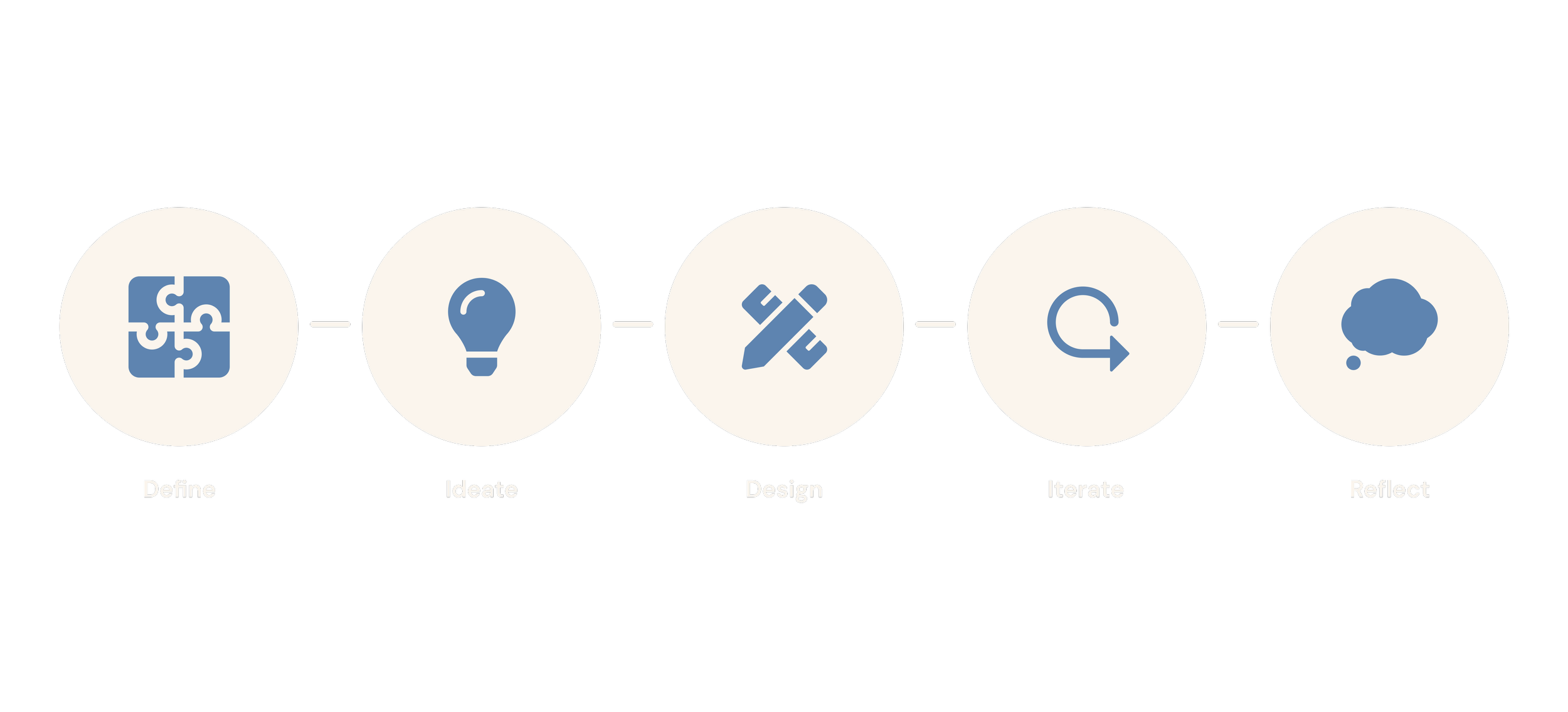
Design process
OVERVIEW
Creative Mandatories
Target Audience
Define
Creative Mandatories
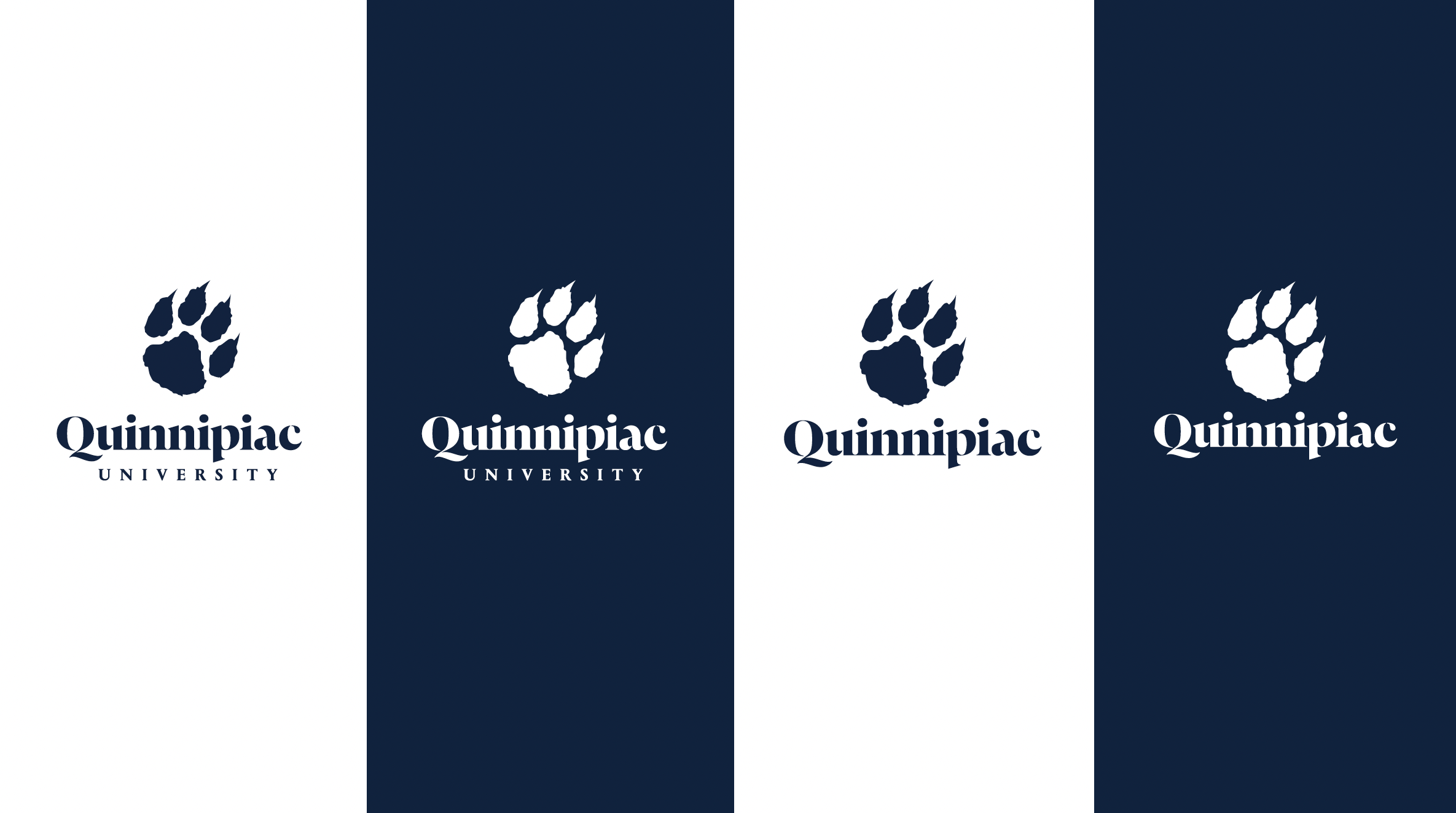
To ensure the new mark integrates seamlessly into the "Ambition Unleashed" brand framework, the design was guided by a set of non-negotiable standards:
Anatomical Authenticity: The mark must specifically resemble an actual bobcat paw—avoiding generic feline or canine tropes to maintain graphic integrity and brand recognition.
Typographic Alignment: The paw must be paired with the current "Quinnipiac University" wordmark, ensuring a unified visual language between the spirit mark and the primary institution identity.
Strict Color Fidelity: All iterations must adhere to university brand standards, utilizing Blue (PMS 295) and Gold (PMS 1245) to maintain professional consistency.
Target audience
The project caters to a broad ecosystem of stakeholders, each with a unique emotional connection to the brand:
Internal Community: Current students, faculty, staff, and athletes who seek a "spirit-forward" symbol for daily pride and athletic competition.
External Stakeholders: Alumni, parents, and prospective students who value the university’s heritage and look to the Bobcat Paw as a recognizable badge of loyalty and tradition.
OVERVIEW
Approach
Inspiration + Research
Existing Quinnipiac Paw Assets
ideate
approach
The ideation phase began with a comprehensive visual audit of legacy assets and a competitive benchmarking study of D1 athletic ecosystems (including Clemson, Ohio University, and Sam Houston State). I explored the balance between anatomical authenticity and graphic simplicity.
Competitive analysis
Analyzing how successful "paw" marks utilize negative space and bold silhouettes.
visual sourcing
Reviewing 2020 exploration files and campus-life variations to identify why previous attempts were either phased out or never reached full production.
INSPIRATION + RESEARCH
PLANNING BURNOUT
Strategic
exploration
Determining the optimal pairing of the paw with the "Quinnipiac University" wordmark vs. the "Bobcats" athletic identity.
existing quinnipiac paw assets
OVERVIEW
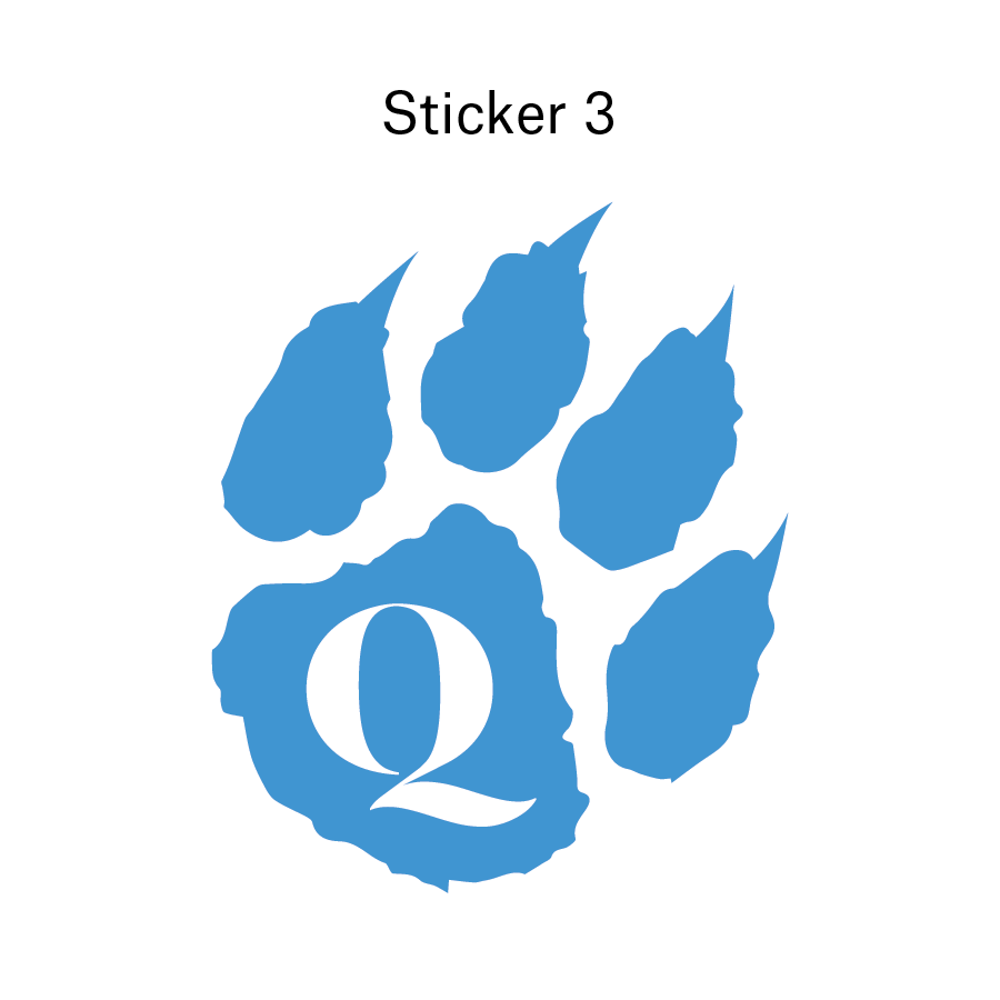
Version 1A
Version 1B
Version 1C
DESIGN
version 1a
The design process focused on creating a scalable, high-impact mark that functions across diverse touchpoints. This includes high-end alumni merchandise to digital social assets and environmental wayfinding. For the first round, I created three different directions.
version 1b
version 1c
OVERVIEW
Feedback
Presentation
iterate
The Showcase phase involved presenting the early version of the Bobcat Paw to University leadership and MarCom stakeholders. The presentation focused on demonstrating how the new mark transitions from a fragmented "unofficial asset" into a strategic brand tool that honors the past while supporting the current university identity.
Feedback
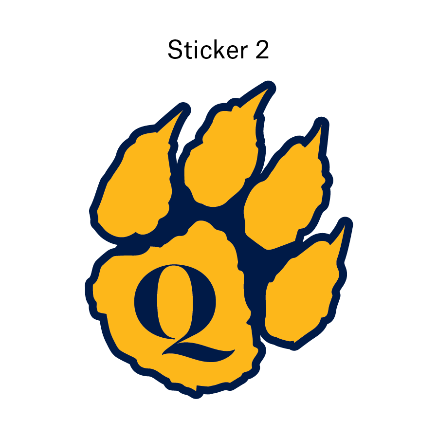
The first round showcase was for internal creative team members and the Version 1A was selected with feedback:
Digital Pads: these need to be slimmer to reflect the bobcat paw anatomy.
Claws: these need to be longer and sharper to make the paw look more “intimidating”
Presentation
Click on the title slide below to see the full presentation shown to university marketing leads and director:
OVERVIEW
The Final Solution
What I Took Away
The Impact
reflect
the final solution
This project reinforced the importance of stakeholder alignment and the power of "emotional branding" in higher education. The new paw mark will be added to the university’s official brand, being used on print, merchandise, digital, and branding material. The mark brings an extra emotional connection between students and the school.
what I took away from the process:
stakeholder
feedback loops
I understood to balance creative with business strategy and audience perception of the art.
competitive analysis
Looking at industry trends and similar businesses guided me to create a logo that was relevant, but differentiated.
PLANNING BURNOUT
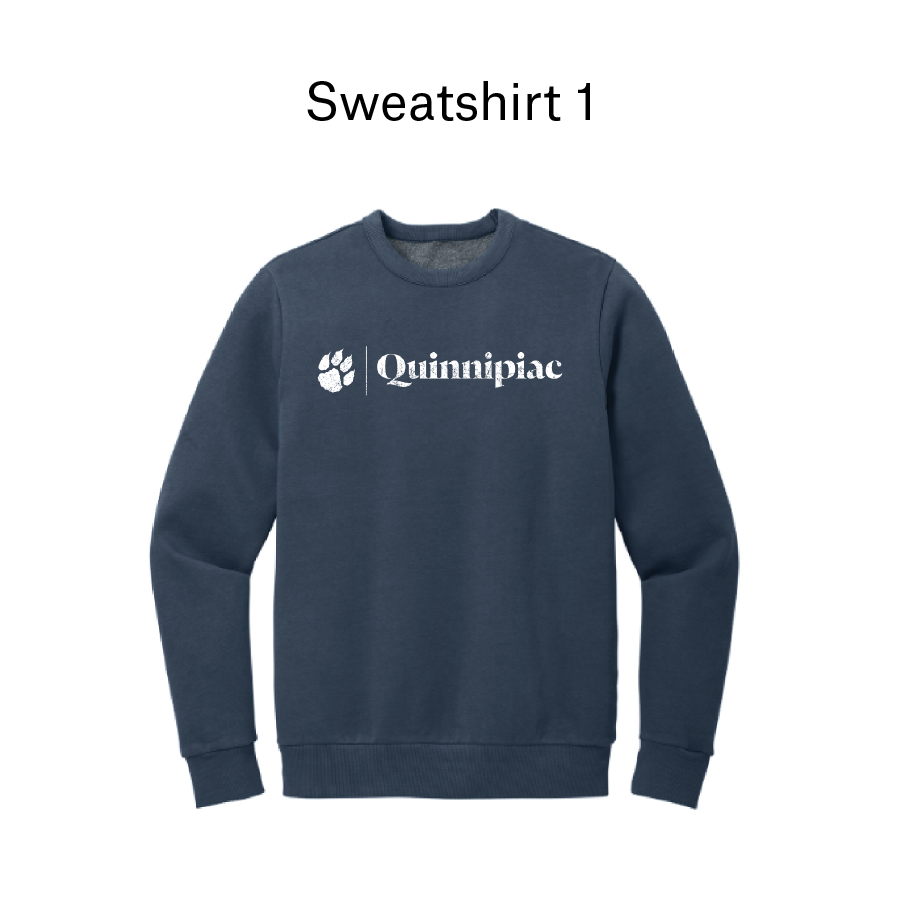
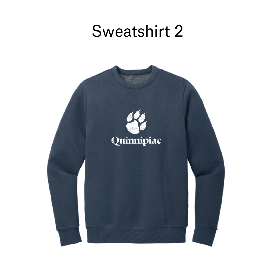
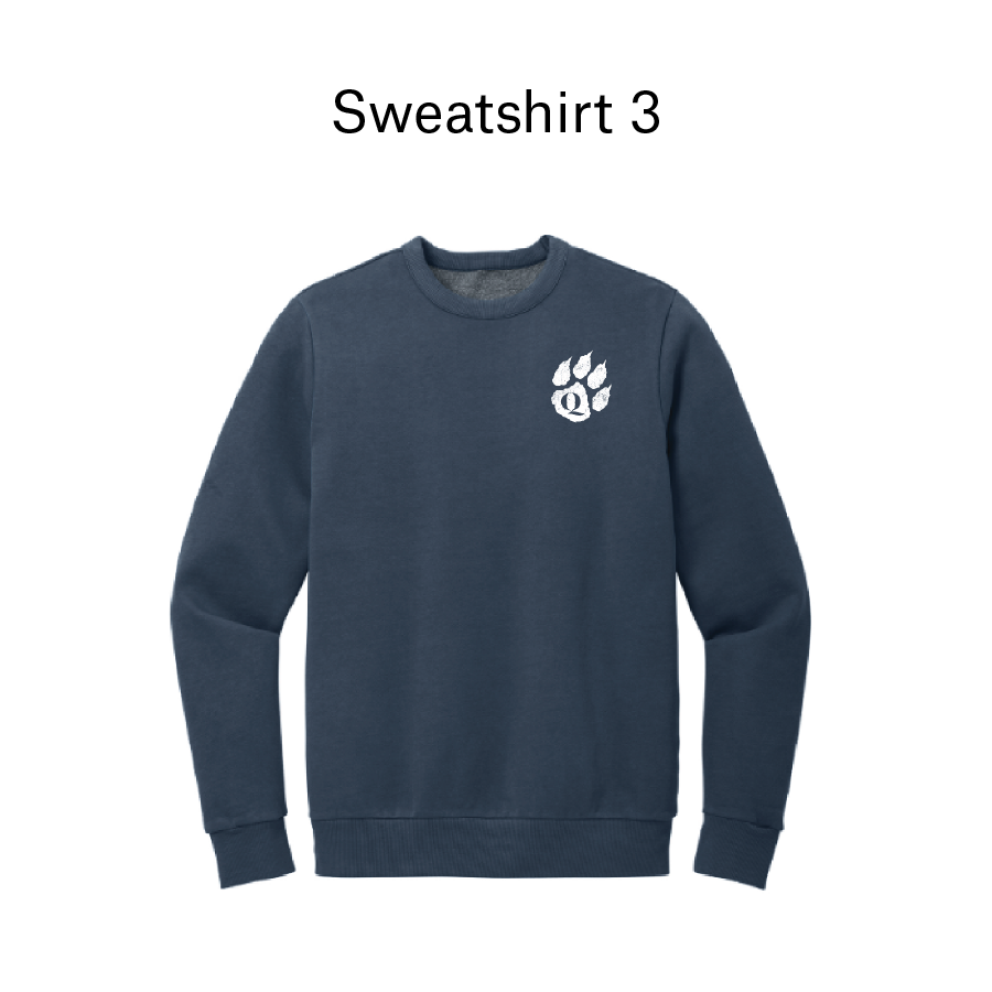
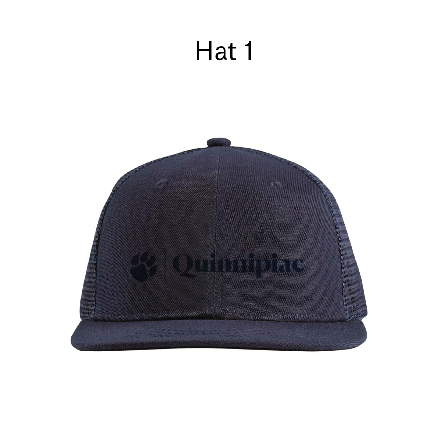
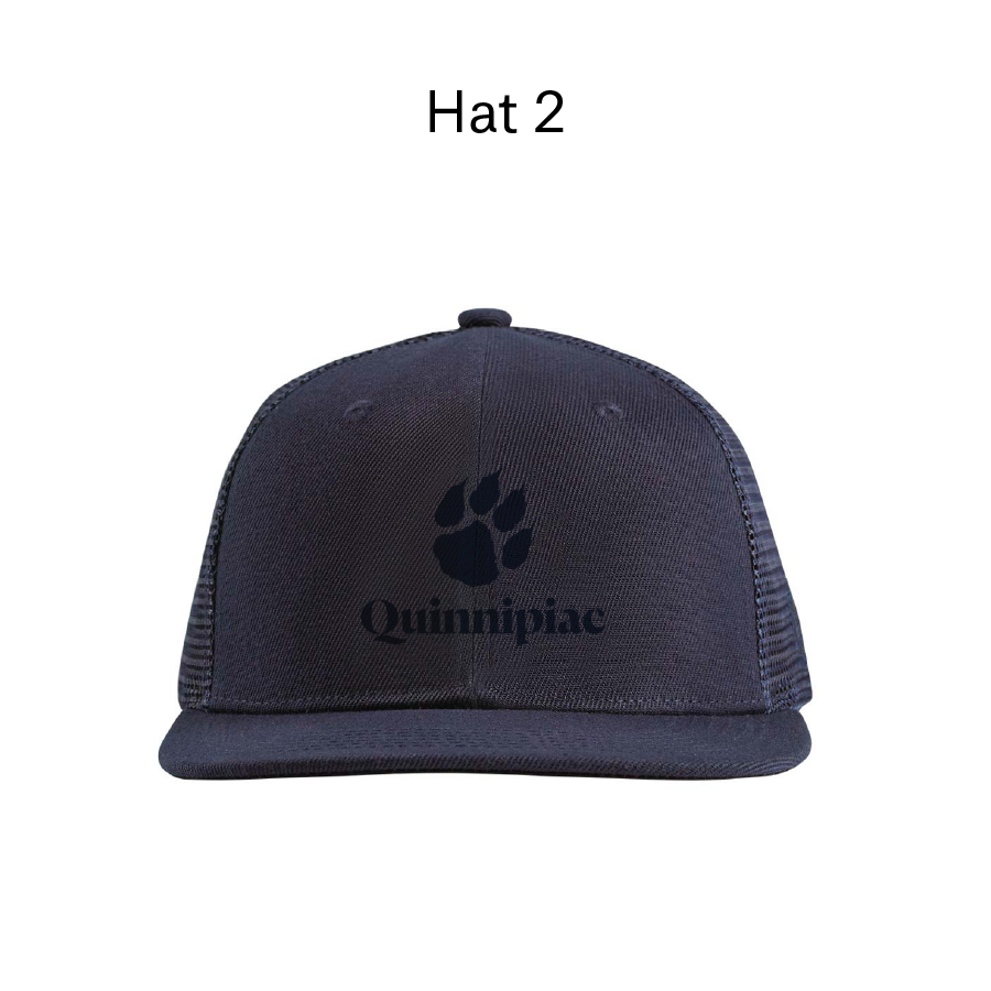
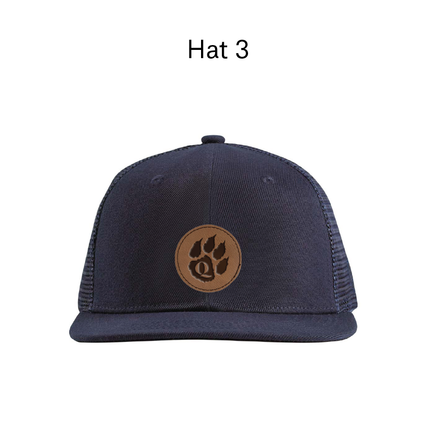
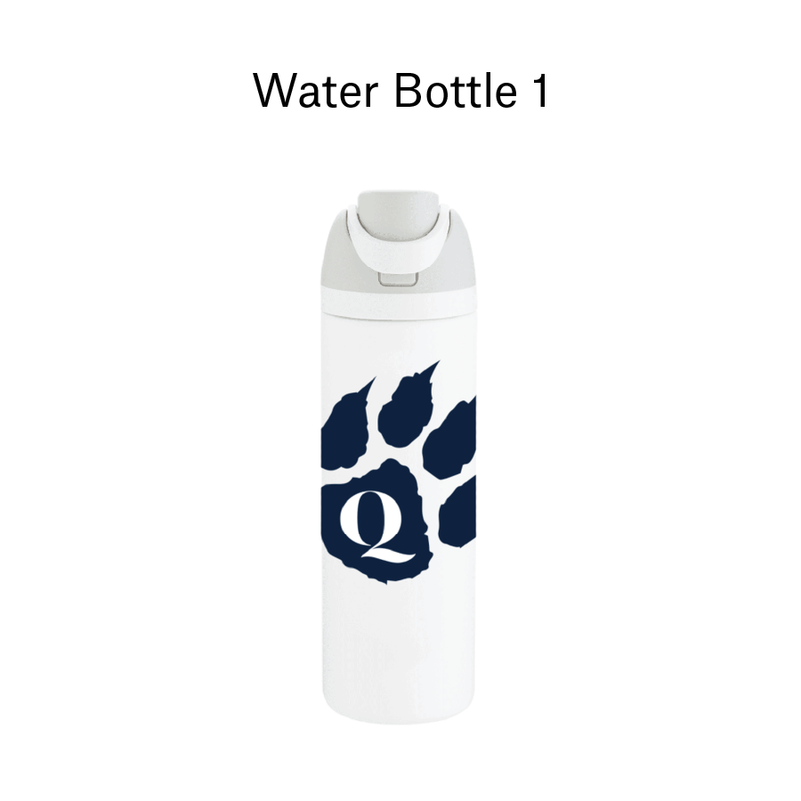
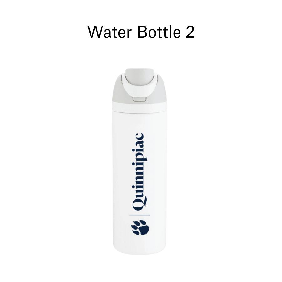
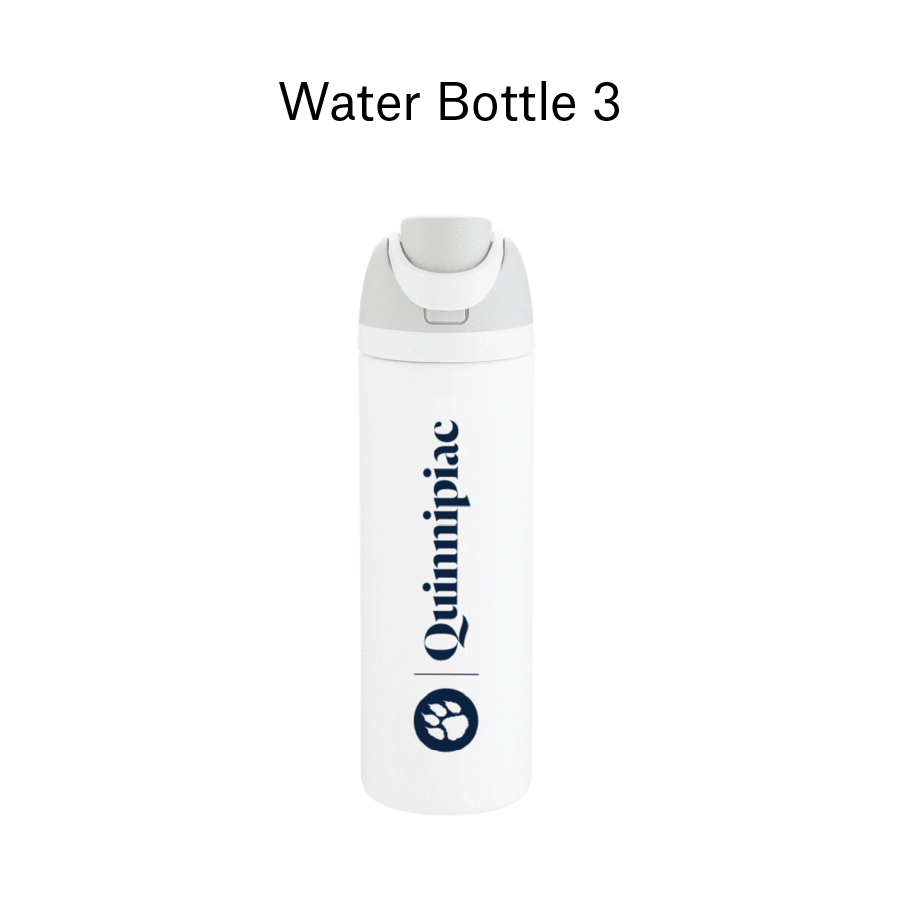
physical
prototyping
Mocking up the logo on different merchandise helped stakeholders visualize the asset.